Books
Books

Fuel
Traversing multivalent intimacies from the underworld of California’s Central Valley oil fields to the quotidian domestic and love’s painful retraction, Stockton’s poems articulate the blurry modes of extraction, fantasy, loss, gender, and labor as they interact and overlap in the shadow of environmental and personal collapse. Between gas station gifts, Venmo requests, and nocturnal love letters, Fuel unravels the self and violent systems of domination, longing for a togetherness that transcends its own ending.
In these poems, Stockton plunges into petrologic, long drives, the beginnings of ends—whatever enters into love between people and makes it so abstract, or common. In other words, its great subject is the edge, and Fuel is a book of horizons. - Benjamin Krusling
Rosie Stockton is the author of Permanent Volta (Nightboat Books 2021) which was the recipient of the Sawtooth Prize as well as being a finalist for the California Book Awards in Poetry and the Publishing Triangle’s Audre Lorde Award for Lesbian Poetry. Their poems have been published by Social Text Journal, VOLT, Jubilat, Apogee, Mask Magazine, Tripwire and WONDER PRESS. They hold an M.A. in Creative Writing from Eastern Michigan University and are currently a Ph.D. Candidate in the Gender Studies Department at UCLA. Rosie lives and works in Los Angeles.

Shifting the Angle of Shine
Quinn Chen, Kira Simon-Kennedy and 1 more
This publication spans a decade of resilient artists and collectives in, around, and about China and the greater Sinosphere. Composed of essays, images, conversations, and projects, Shifting the Angle of Shine documents innovative tactics of artists and collectives as they weave relationships of mutuality and solidarity to thrive through the cracks.
Shifting the Angle of Shine explores how artists experiment with practices ranging from idiosyncratic business models to counterfeit and mimicry as tools for cultural change, from DIY collectives searching for stability to artists developing new ways to dance around the restrictive pressures of a capitalistic mainstream, and much more. In bringing these artists together to speak and lay compiled in this book, we ask ourselves: what kind of spaces are necessary to incubate productive conversations in an art world prone to creating destabilizing conditions?
Spanning the art nonprofit's decade of existence, a lot of the work has been documented in fragmented ways over the internet, on social media accounts, and in the memories of those there in person. Through materializing this project, this publication hopes to not only shine light on the work of some artists and collectives we admire, but also to archive their stories, processes, and methodologies that should be passed on.

Blame It On The Rain
The second poetry collection from artist, curator and writer Hana Pera Aoake. The book begins with a placenta placed into a Pohutukawa tree and spirals out across manifold interrogations and anecdotes of the poet’s life. the poetry harnesses a vibrant decolonial commentary on the life/death cycle:
“Bodies that span the past, present and future
It’s non linear, omnipresent, human and non human”
The poetry maps ways in which the lived and living memories of colonial histories are held, endured and warped inside one’s body, which is to say the whole Earth. “Pain and age are knotted together” she states. In many ways the book attempts to illustrate a delicate symbiosis of all living and non-living things, yet localises the pain and joy which manifests from these systems within her own life. The poetry asks how ideology changes the way we love, parent and make art.
Hana Pera Aoake expands these cyclical frameworks of flux and impermanence across her otherwise diaristic and witty verse. Hana Pera Aoake writes on sculpture, anger, labor, detention, greed, genocide, the ocean, the family, sovereignty, sanity and love. The writing spares no opportunity for irony and opinion, housing articulations of political dreaming within a resilient and potent humour. The book is generous in its exploration of Māori belief systems and indigenous solidarity as much as it is on rhythmic, free-associative verse. An exciting and expansive collection of poems.

In the Delirium of the Simulation: Baudrillard Revisited
Third edition featuring afterword by Alessandro Sbordoni & several appendices, including a new translation & edit of “Taylor Swift Does Not Exist”.
This is a monumental and extensive work from someone who is arguably the most well-versed scholar of Baudrillard, Deleuze & Laruelle in the German-speaking world, Achim Szepanski, the original founder of Mille Plateaux, Force Inc Music Works and NON. This book is dedicated to Jean Baudrillard, who would be described by Achim as the most radical and advanced stimmung in Philosophy. Through this comprehensive and devouring analysis of Baudrillard’s work, the author presents a gripping account of their own philosophy; alongside his magnum opus Die Ekstasie der Spekulation, this book, In the Delirium of the Simulation, provides the strongest case for what might be called, in light of his passing, Szepanskism or Szepanskian Economics.
From Finance, to non-philosophy and radical experimental music, Szepanski is an anomalous and unique theoretician with one hell of a history.
CONTENTS:
- Metabox of Terms: Simulation, Code, Hyperreality, Fractal, Seduction and Implosion
- Baudrillard's Maximisation Hypothesis: the System and the Other
- Baudrillard & Marxism: Signs, Production and Money
- Distinguishing the Consumer System (or Shopping Mall) from the Landfill
- Baudrillard & the Financial Simulacrum
- Excursus on Jonathan Beller's World Computer
- Hyperreality & Artificial Intelligence
- Baudrillard & Quantum Theory
- Afterword: Hyperculture by Alessandro Sbordoni
- Appendix 1: Taylor Swift Does Not Exist
- Appendix 2: Baudrillard: After the Orgy
- Appendix 3: Imagination & Reality: Psychoanalysis vs Baudrillard

The Fast-Growing Stinking Escaped Waste-Loving Wall-Breaching Self-Cloning Other-than-Natural No-Man’s Tree
The fast-growing stinking escaped waste-loving wall-breaching self-cloning other-than-natural no-man’s tree is a 4000-word bilingual English-Arabic photo essay examining the ecological, political and historical significance of ailanthus altissima (tree of heaven) in occupied Palestine. Introduced by the Jewish National Fund during its Jerusalem Forest afforestation projects from the 1960s to 1980s, this tree flourished across various urban fringes, roadside areas and seemingly abandoned land. Known for its pungent odour, which earned it the nicknames ‘tree of hell’ and the ‘stinking tree’, it is now classified by the Israeli Ministry for the Protection of the Environment as an invasive species.
Drawing on her formative experiences in Palestine and an interest in trees as political agents, Palestinian architect, artist and researcher Areej Ashhab provides a first-hand account of the invasiveness embodied by this unregulated, fast-growing weed-tree. The text is enriched by annotations by Catalan-British trans writer, researcher and community organiser Ailo Ribas, who unpacks the concepts of 'weediness' and explores issues of belonging and resistance within Palestine’s settler colonial context. Accompanied by recent photographs of the tree across Palestine, the publication lays bare the intricate root system and complex ecologies that underlie our geopolitical narratives.
This publication was realised through the support of Sharjah Art Foundation’s annual publishing grant (2023).
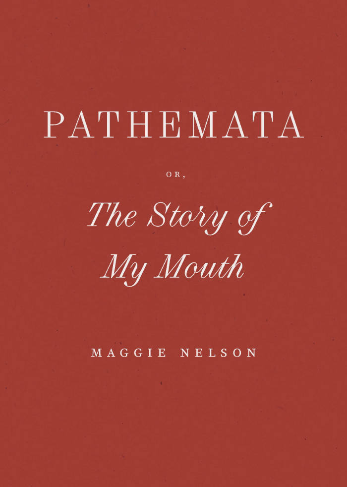
Pathemata, Or, the Story of My Mouth
Pathemata, Or, The Story of My Mouth is an experiment in interiority written in the pandemic studio. Something of a companion piece to 2009's Bluets, Pathemata merges a pain diary chronicling a decade of jaw pain with dreams and dailies, eventually blurring the lines between embodied, unconscious, and everyday life.
In scrupulously distilled prose, Pathemata offers a tragicomic portrait of a particularly unnerving and isolating moment in recent history, as well as an abiding account of how it feels to inhabit a mortal body in struggle to connect with others. Formally inspired by Hervé Guibert's The Mausoleum of Lovers, and conceptually guided by Gilles Deleuze's notion of artist as symptomologist, Pathemata is yet another urgent innovation from Maggie Nelson in the art of life-writing.
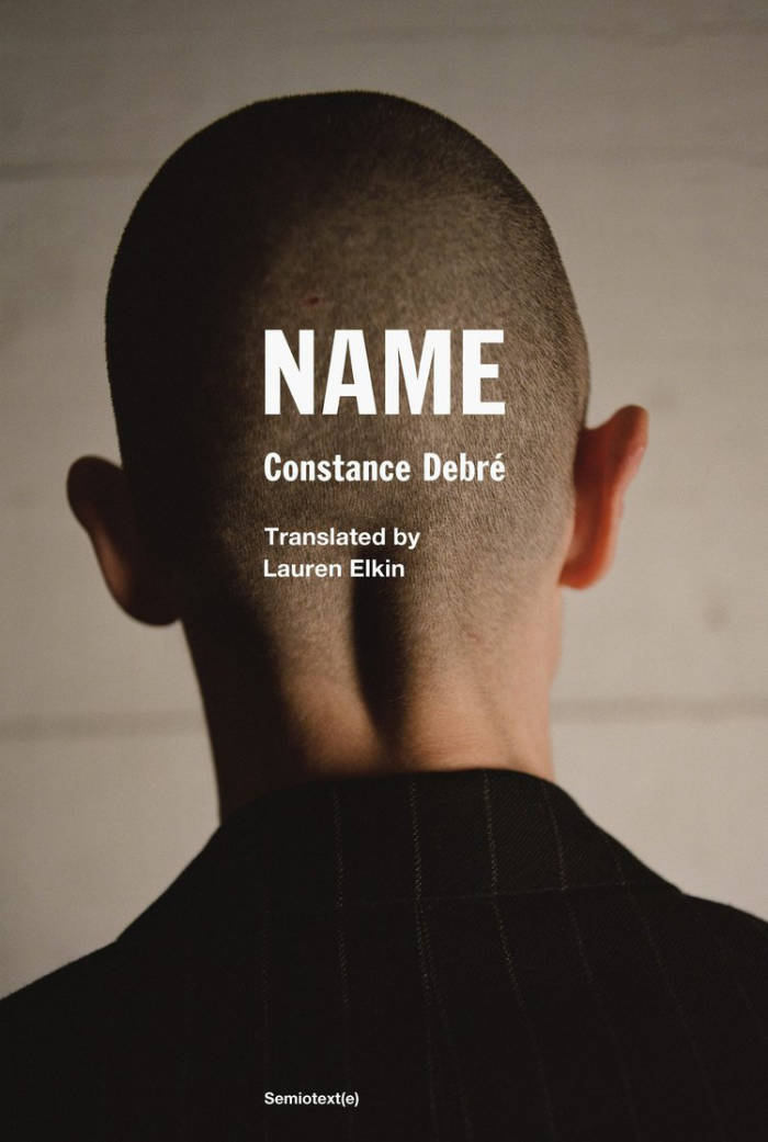
Name
Name, the third novel in Constance Debré’s acclaimed trilogy, is at once a manifesto, an ecstatic poem, and a political pamphlet. By rejecting the notion of given identity, her narrator approaches the heart of the radical emptiness that the earlier books were pursuing.
Newly single, and having recently come out as a lesbian, the narrator of Debré’s first two novels embarked on a monastic regime of exercise, sex, and writing. Using the facts of her own life as impersonal “material” for literature, Playboy and Love Me Tender epitomized what Debré (after Thomas Bernhard) has called “antiautobiography.” They introduced French and American readers to her fiercely spare prose, distilled from influences as disparate as Saint Augustine, Albert Camus, and Guillaume Dustan. “Minimalist and at times even desolate,” wrote the New York Review of Books, these works defied “the expectations of personal growth that animate much feminist literature.”
Name is Debré’s most intense novel yet. Set partly in the narrator’s childhood, it rejects Proustian notions of “regaining” the past. Instead, its narrator seeks a state of profound disownment: “We have to get rid of the idea of origins, once and for all, I’m not holding on to the corpses. … Being free has nothing to do with that clutter, with having suffered or not, being free is the void.” To achieve true freedom, she dares to enter this “void”—that is, dares to accept the pain, loss, and violence of life. Brilliant and searing, Name affirms and extends Debré’s radical project.

Poetry, or else...
The poet, the unknown being… a loony, a dreamer, a hermit. The poet writes poetry… but really, what is poetry? Arts, politics, mere amusement?
This little book is an insight into the mindset of someone who just can’t help but to be a poet. It is a manifesto for the freedom of thought and expression, an essential source of motivation and inspiration for readers and writers alike.
Anisur Rahman (b.1978) made his poetic debut in 2003. As a journalist, translator and playwright he has further contemplated the poetic mind. Born in Bangladesh, he writes in both Bengali and English, but nowadays lives exiled in Sweden.
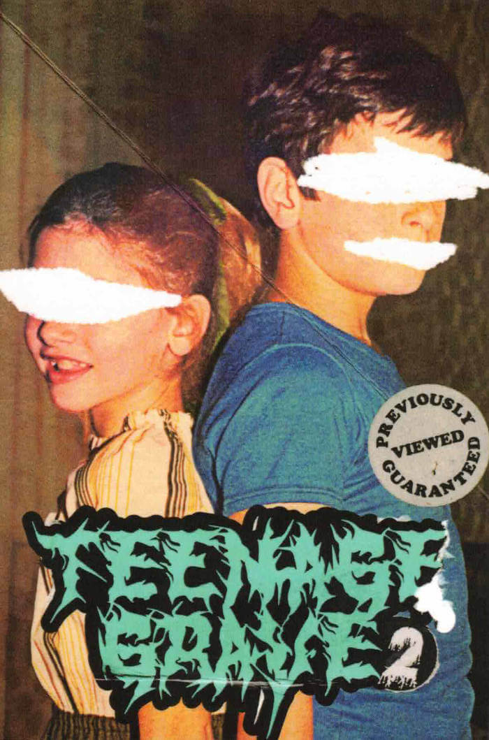
Teenage Grave 2
Sam Richard, Jo Quenell and 2 more
Blending splatterpunk, body horror, and transgressive fiction, Teenage Grave 2 immerses readers in a world of unrelenting terror. This masterful work of macabre fiction assaults the senses and challenges perceptions of safety, leaving readers deeply unsettled. Featuring Sam Richard, Justin Lutz, Brendan Vidito and Jo Quenell.
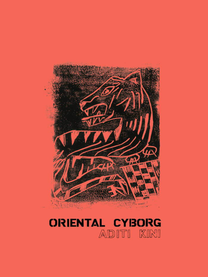
Oriental Cyborg
Who is the Oriental Cyborg? asks Aditi Kini in this collection of notes, jokes, and queries into the provenance of a creature designed for labor, 3-D printed in the technoscientific post-colonies, modeled on old automata. Race is a technology, that we know, and technology can be raced — so why inquire into this at all? Perhaps this, the Oriental Cyborg, is a fantasy more than a memory, or an echo more than a form — or just an essayist’s extraction of personal anguish and humor from globalist decay.
Taking on the form of historical analysis / lyrical essay / documentary poem / experimental buzzword / positionality statement, this chapbook and its titular character might still be an elusive mystery even after reading.
“’What is a ghost but a person removed from corporeality?’ This is one among layers of questions Aditi Kini poses in Oriental Cyborg, a lyrical excavation into survival in the era of techno racial capitalism, and its “deleting touch” that so easily voids—reduces to faceless services—the exploited individuals performing various acts of techno-labor. A grieved searching drives this hybrid essay, which feels urgent and necessary as threats from AI grab headlines. This work compels us to see our culture’s love affair with technological progress as a means for continued colonization and domination. It also reminds us, and celebrates, that those erased don’t stay silent forever. We privileged may not be able to hear them yet, but those who are listening know. They roar.” — Allison Cobb
“In the mirror of Aditi Kini’s Oriental Cyborg, I become the monster—a hopeless automaton, an intelligence stripped of roar. With titanium-threaded theory, Kini radiantly stitches together the ideal Asian working machine. Get your own Oriental cyborg today: super dazzling and sexy, historically embroidered, an oracular truth who never tires, never complains, forever mute, what perfection!” — Lily Hoàng
Aditi Kini is an undisciplined writer. They’ve done both NYC and the MFA (at UC San Diego). They were a finalist/alternate for the 2020-22 Jerome Award for Literature. They edit Lumpenpockets, “a nonquarterly sick rag.” Read their words in Hayden’s Ferry Review, The Rumpus, Denver Quarterly, The New York Times, and elsewhere. They’re at work on multiple projects, all at once. They are blessed with two dogs, Lucy the Happy and Charly Kong, who make life worth living.

Weaving Language I
Weaving Language I: Lexicon is the first book in the Weaving Language series, which examines the poetics of weaving traditions through historical research as well as contemporary practices. Attempting to dismantle and rebuild commonplace understandings of the history of writing, Weaving Language focuses on fiber-based forms as a longstanding but often overlooked medium for record-keeping, storytelling, and poetry.
In Weaving Language I: Lexicon, weaving processes are mapped onto English grammar to suggest a method for reading woven works. Offering visual vocabularies as both discrete concrete poems as well as a collection of translatable terms, this book invites readers, writers, and weavers to participate by considering weaving as a system that can be decoded. Textile forms are broken into the basic building blocks of language, presented as a visual/textual lexicon.
Weaving Language I: Lexicon was initially self-published by Capone in 2012 and in 2015 re-issued in an edition of five as an artists’ book, which was awarded the Frances Mason Harris ’26 Prize from Brown University.
Essay Press’s edition makes this important work available for the first time in a trade edition. The edition has also been newly edited and significantly expanded into a multivocal work that represents the contributions of a small collective of artists including Martha Tuttle, Allison Parrish, Sarah Zapata, Adjua Gargi Nzinga Greaves, Amaranth Borsuk, and Imani Elizabeth Jackson, thanks to funding from the Oregon Arts Commission and the Ford Family Foundation. The book also includes an afterword by Kit Schluter and diagrams by Anni Albers (with permissions from the Josef and Anni Albers Foundation).
Plans are underway to similarly expand and reissue the two additional books in the series both previously published in limited editions currently out of print: Weaving Language II: Language is Image, Paper, Code, & Cloth (information as material, York, UK, 2018) and Weaving Language III: Writing in Threads (Center of Craft, Asheville, NC, 2017). The Weaving Language project has been accompanied by numerous gallery shows, including “Material Memory,” a show running from October 7 through November 9, 2022, at Nationale in Portland, Oregon, to accompany the release of the Essay Press edition of Weaving Language I.
Artists’ books from the Weaving Language series are held by the collections of the Museum of Modern Art Library in New York, NY; the Thomas J. Watson Library at the Metropolitan Museum of Art in New York, NY; the Harris Collection of American Poetry and Plays at the John Hay Library at Brown University in Providence, RI; and at the Joan Flasch Artists’ Book Collection at the School of the Art Institute of Chicago in Chicago, IL.
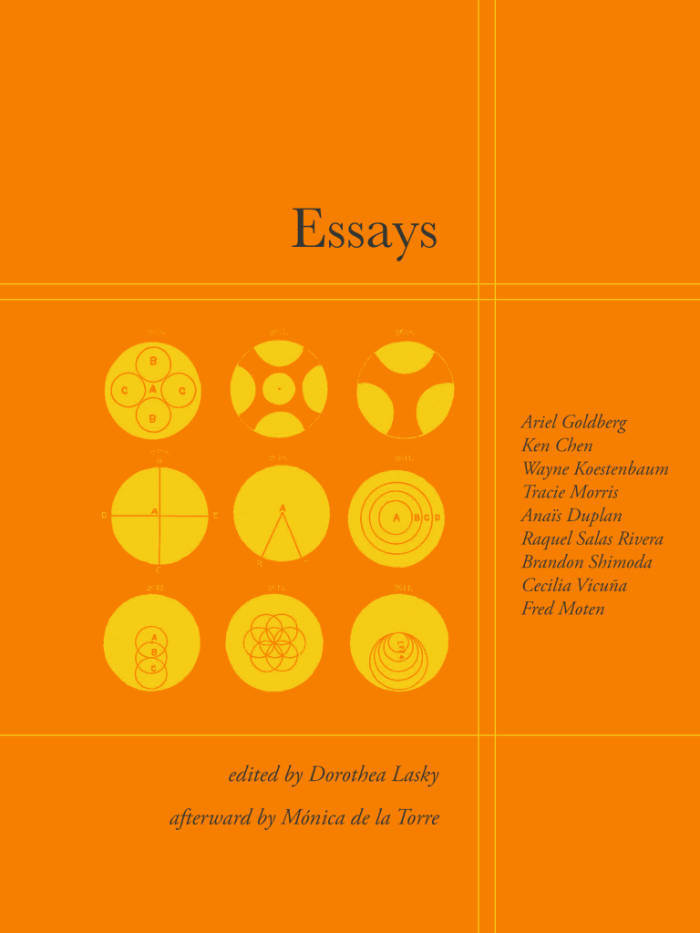
Essays
Poetry as both a form and genre has many possibilities to exist within; however, poetry too often is burdened by the imperative to have an argument and a set of imagery and meanings that are preconceived and placed within the poem. In this way, poetry gets conflated with writing a thesis or project, and the poet simply the presenter of perfectly argued language. When poets attempt to bridge the gap between genres and write within the contemporary essay form, they are tasked to construct perfect arguments there as well and avoid the associative and aesthetic logic that makes poems important. The term essay itself was coined by Michel de Montaigne in the 1500s — it comes from the French word essai, which means to test or experiment with what one knows as a learning tool, and is in partial opposition to the terms we use to discuss the essay now
ESSAYS calls on thinkers and writers to move beyond this linear thinking into the realm of what an essay by someone like Montaigne might do. His essays do as they say they will—they test out ideas, they are unafraid to get messy in their execution, they are brave enough to go forward into the uncharted waters. In them, it’s completely beside the point to get back to where they started, let alone where they’d say they would go. They are simply beside the point. It’s true.
ESSAYS, edited by Dorothea Lasky, is a book of essays on the essay, which enact and query these directives. The volume collects essays by poets Ariel Goldberg, Ken Chen, Wayne Koestenbaum, Tracie Morris, Anaïs Duplan, Raquel Salas Rivera, Brandon Shimoda, Cecilia Vicuña, Fred Moten, and Mónica de la Torre.
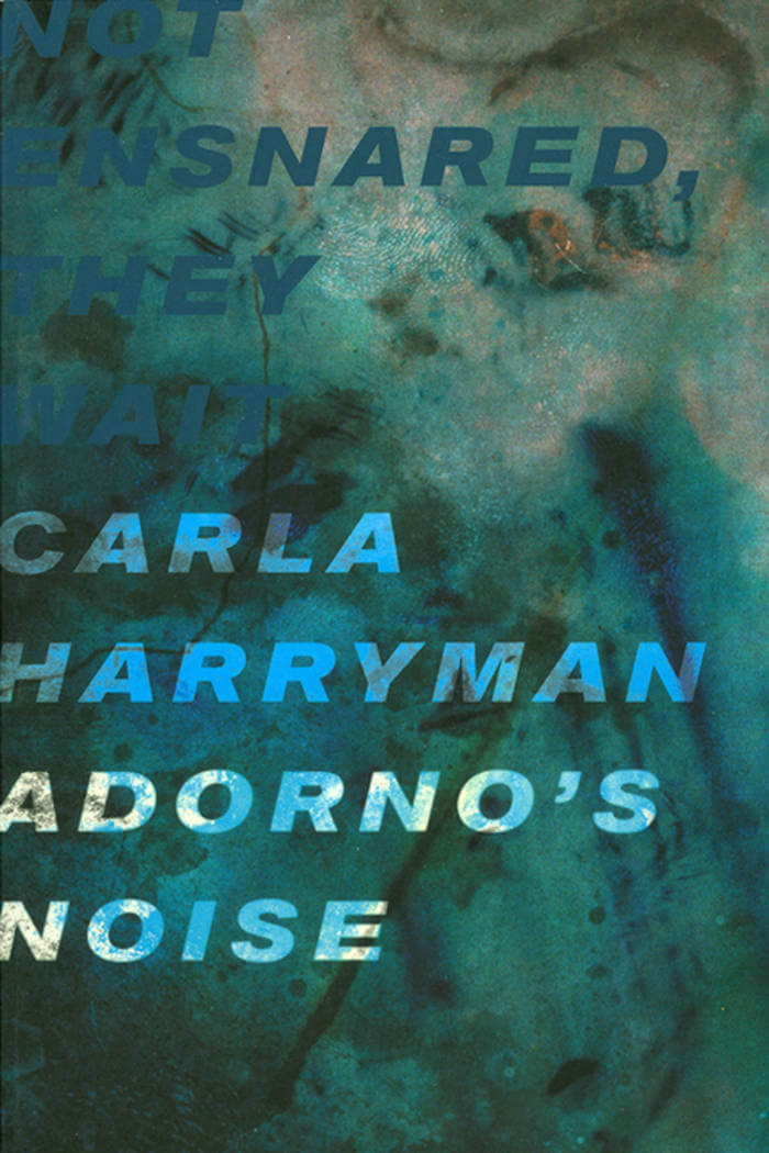
Adorno's Noise
Adorno’s Noise is a collection of experimental, poetic, and conceptual essays. Adorno’s Noise takes a stunning plunge into a kaleidoscopic world of globalization, female sexuality, the place of art and artist, and the looming power of the state. Phrases from Theodor Adorno’s aphoristic philosophical text, Minima Moralia, serve as catalysts for an explosion of thought and language that quickly breaks Adorno’s orbit.
“This work by Carla Harryman, startlingly astute, once again proves how necessary an encounter with her writing has become for us today. Her grasp of theoretical and poetic exigencies is unbypassable, and she moves lightly, lifting the prose poem into the amplitude of a new articulation.” — AVITAL RONELL
“Adorno’s ‘noise’ may be nothing more than the consonance of late modern capital talking to itself, but Carla Harryman listens to Adorno listening, and what she hears is a very different sort of dissonance, something Adorno himself may have been deaf to. Listening for a noise that can’t be heard, Harryman attends to the disruption of signal the aesthetic artifact called a corpse at the limit of Adorno’s magisterial eloquence, where thought steps over the body. Atonally faithful to his negativity the afterglow of torment passing through figures of speech while refusing the authority of a masterful dialectic, Harryman makes our unthought horizon “normality is death” audible, presencing a body that can’t be redeemed by aesthetics the bosy wants tobe art and fails at it. From Gender the Status of Dogs to works by Sun Ra, Anais Nin, Robert Smithson, and Kenzaburo Oe, this radically asynthetic writing moves thru polyphonic configuration of word, image and concept. Synthesia? Emotional truth? The intersection between abstraction and narration? Practicing a militant ethic of non-mastery as every one of its sentences sounds like a sensory organ in the process of becoming its own theoretician. Adorno’s Noise reinvents the “essay as form,” but it doesn’t stop short of reinventing thinking.” — ROB HALPERN
Carla Harryman is the author of twenty-four books of poetry, prose, plays, and essays. Harryman is widely acknowledged as an innovator in poetry, prose, and inter-disciplinary performance. An active collaborator, she is one of ten co-authors of The Grand Piano, an Experiment in Collective Autobiography: San Francisco, 1975-1980 (2006-2010). Open Box, a CD of music and spoken text performance created with composer and musician Jon Raskin was released on the Tzadik label in 2012. Her Poets Theater plays and music/text collaborations have been performed nationally and internationally, including at dOCUMENTA 13, where she presented the closing keynote performance Occupying Theodor W. Adorno’s “Music and New Music,” a music/text work that folds segments of Adorno’s Noise into her poetic adaptation of Adorno’s lecture. She is the editor of two critical volumes: Non/Narrative, a special issue of the Journal of Narrative Theory ( 2012) and Lust for Life: On the Writings of Kathy Acker (with Avital Ronell and Amy Scholder, Verso, 2006).
Other books by Carla Harryman include the collection of poetry and performance writings published in French and English editions Sue in Berlin and Sue á Berlin (2017); A Voice to Perform (Split/Level 2020); the epistolary essay, Artifact of Hope (2017); the diptych W—/M— (2013), Gardener of Stars: A Novel (2001), and two volumes of selected writing: Animal Instincts: Prose, Plays, Essays (1989) and There Never Was a Rose without a Thorn (1995). Her grants and awards include The Foundation of Contemporary Art, New York, Opera America Next Stage (with Erling Wold), and The Ronald W. Collins Distinguished Faculty in Creative Activity Award from Eastern Michigan University, where she serves on the faculty of an interdisciplinary creative writing program.

Death Industrial Complex
Candice Wuehle’s Death Industrial Complex is a meditation on the cultural obsession with the bodies of dead women and an occult invocation of the artist Francesca Woodman. Like Woodman’s photographs with their long exposures and blurred lenses, this book is haunted and haunting, hazy yet devastatingly precise. These are poems as possessions, gothic ekphrases, dialogues with the dead, biography and anti-biography, a stunning act of “cryptobeauty.”
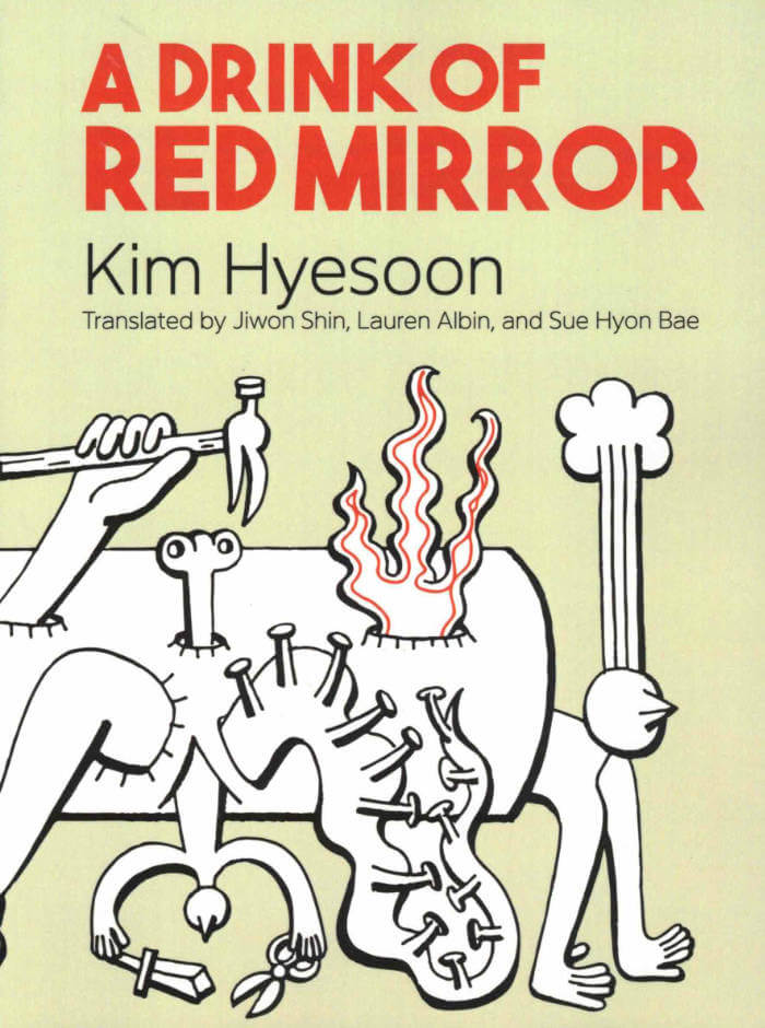
A Drink of Red Mirror
A landmark feminist poet and critic in her native South Korea, Kim Hyesoon’s surreal, dagger-sharp poetry has spread from hemisphere to hemisphere in the past ten years, her works translated to Chinese, Swedish, English, French, German, Dutch, and beyond. In A Drink of Red Mirror, Kim Hyesoon raises a glass to the reader in the form of a series of riddles, poems conjuring the you inside the me, the night inside the day, the outside inside the inside, the ocean inside the tear. Kim’s radical, paradoxical intimacies entail sites of pain as well as wonder, opening onto impossible—which is to say, visionary—vistas. Again and again, in these poems as across her career, Kim unlocks a horizon inside the vanishing point.
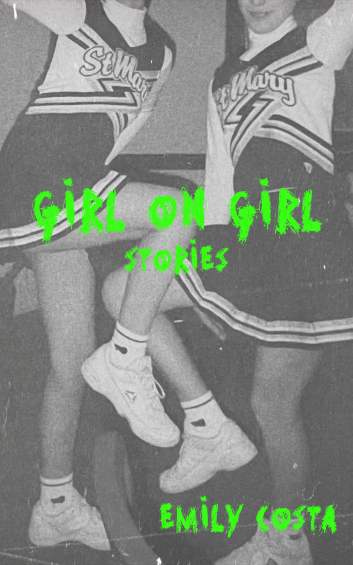
Girl On Girl: Stories
What happens when you peak in high school, or maybe earlier, or maybe not at all? When you hate your friends, or love them too much? When the warmth of nostalgia starts to slowly poison you? In Girl on Girl, Emily Costa explores desperation and loneliness, screen obsession, and casual cruelty as characters—mostly women and girls—struggle to be seen.
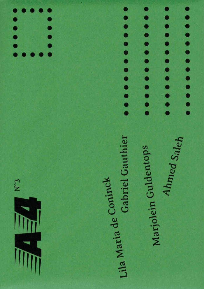
A4 review N°3
Marjolein Guldentops, Ahmed Saleh and 2 more
Founded in 2023, A4 is a poetry review which showcases and explores contemporary writings practices. Run by Littérature Supersport collective, the object is seen as the extension of their events. The review takes the form of 4 postcards which, when placed side-by-side, form an A4-sheet. A light (even precarious) format for literature that slips into the back pocket of pants and hangs on fridge doors. Each issue features unpublished texts by 4 authors. Wrapped in colors, A4 is distributed by post and available in good bookshops, in Brussels, Liège, Paris and Marseille.
This third issue presents texts by : Lila Maria de Coninck, Gabriel Gauthier, Marjolein Guldentops & Ahmed Saleh.
Ahmed Saleh (born 1998) is a Palestinian writer and poet from Gaza. He studied business administration and political science and is currently living in Brussels. Ahmed writes articles in Arabic and English, several of which have been published on various platforms.
Marjolein Guldentops (Belgium, 1994) is a visual artist, author, and performer. Her artistic practice spans various mediums, including text, video and performance. Rooted in the concept of worlding, her work explores the urban rhythms, flows, and semantics that shape perceptions of space and language in both physical and metaphysical senses.
Gabriel Gauthier is a graduate of the Beaux-arts in Paris. He writes books, performs and makes music. He has published Simurgh & Simorgh and Contra at Théâtre Typographique (2016, 2024) and Speed at Vies Parallèles (2020). He has designed pieces at the border of dance and visual arts (Cover, Rien que pour vos yeux). Space, his first novel, was published by Corti.
Lila Maria de Coninck (2004) is a Belgian creator living in The Hague. She makes music, theatre and writes poetry. The guiding principle in her works is the use of multilingualism and miscommunication to promote creativity in her mother tongue, Dutch.
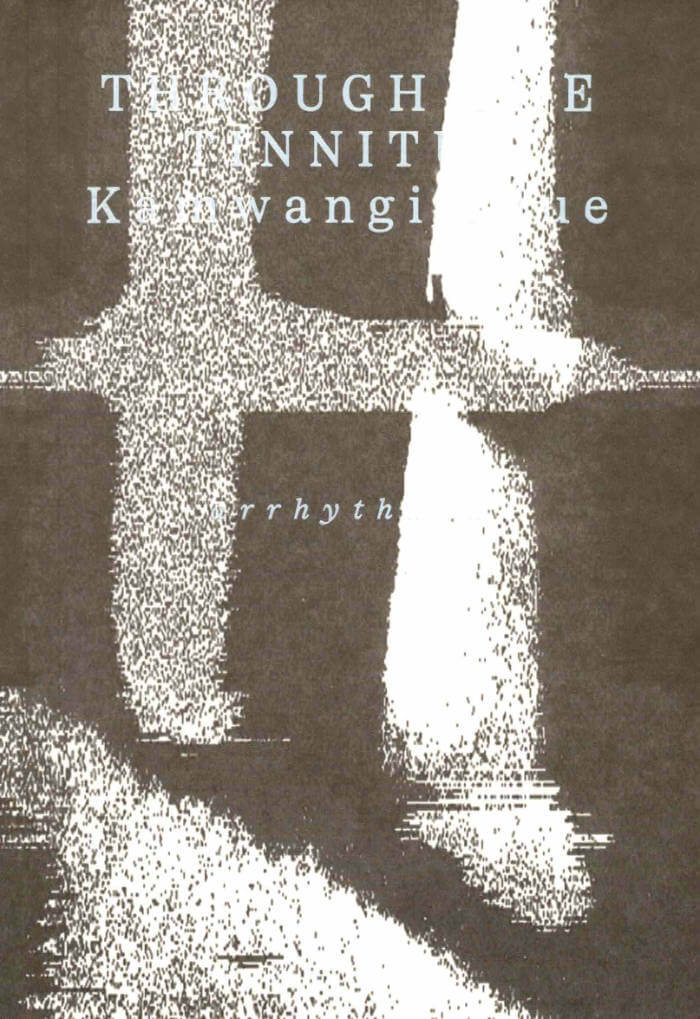
Through the Tinnitus
Through The Tinnitus explores spatial and sonic phenomena through psychoacoustics—the scientific study of how sound is perceived psychologically. Using a version of the pioneering Soviet-designed ANS photo-optical synthesiser, images taken in the artist’s locale, the Jamhuri and Sabaki Neighborhoods of Nairobi, are processed and converted into graphical or drawn sound. In the sound work accompanying the book, these ekphrastic rhythms hum to the sonic backdrop of political violence and utopian dreams.
A free download code for the album will be provided on purchase of the book.
Kamwangi Njue is a multidisciplinary artist, writer, and experimental beatmaker from Nairobi, Kenya.
Through The Tinnitus is published as part of Arrhythmia, a series curated for Book Works by Katrina Palmer.
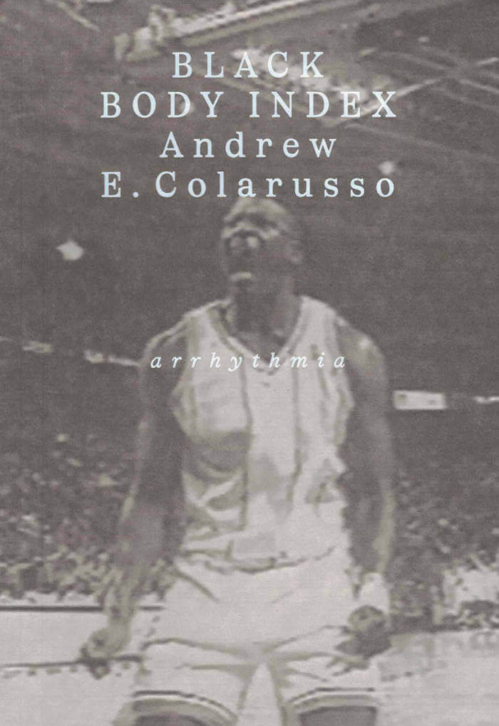
Black Body Index
Andrew E. Colarusso’s Black Body Index takes the concept of the ‘ideal black body’ as its guiding object. In thermodynamics and physics, the ideal black body is a theoretical object that absorbs and emits all incident radiation. No such object exists, though a few come close…
Told in a mercurial constellation of fragments that move between memoir, poetry and thermodynamic theory, Andrew E. Colarusso’s Black Body Index inspects the ‘thingification’ of an ideal black life and refutes it—insisting on the freedom to live beyond the demands of an enforced objecthood.
Black Body Index is published as part of Arrhythmia, a series curated for Book Works by Katrina Palmer.
Andrew E. Colarusso was born and raised in Brooklyn, New York City. He occasionally writes things when not tending to his bookstore, Taylor & Co. Books, in the Ditmas Park neighbourhood of Brooklyn.
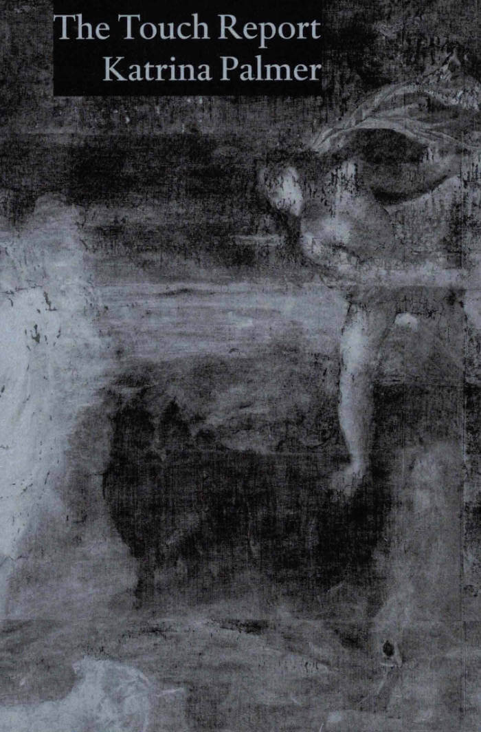
The Touch Report
‘Katrina Palmer’s The Touch Report asks a question that remains in motion for the duration of this extraordinary book. What is here? What’s still here? Here, Palmer writes an account of subjugation that is gestural, an on-going sequence of expulsions and punctures… Is there a kind of writing so transient it’s barely there? In Palmer’s writing, we encounter an ethics of presence and form that is deeply moving, completely and unbearably real.’ — Bhanu Kapil, author of How To Wash A Heart
An artist is invited to take up residency in a gallery filled with historical paintings. They are meticulously crafted, maintained, and revered. She begins to make an audit of the paintings, outlining the depictions of violence, subjugation and physical tension on public display. Eleven arrows in a torso, someone’s hair cut as they sleep, a man nailed to a cross. Horses, decapitations, memorable lobsters.
Written in sparse, urgent fragments that invite closer reading, The Touch Report, turns the reader’s gaze into the dark, to question our notions of ‘civilisation’.
Want to see something real, says the artist as she creeps through the darkness, keeping a log.
Katrina Palmer was commissioned by the National Gallery, London, as part of the 2024 National Gallery Artist in Residence Programme in collaboration with the Contemporary Art Society, generously supported by Anna Yang and Joseph Schull. This book is published as a result of research made during this residency.
Curatorial Design – A Place Between
Wilfried Kuehn, Dubravka Sekulić
The future of architecture lies in the curatorial approach. This is the thesis put forward by architect Wilfried Kuehn and theorist Dubravka Sekulić in their book Curatorial Design: A Place Between, which brings together contributions from more than 30 authors working in the fields of architecture, art, and curatorial knowledge and practice.
Architectural design and the curatorial share a non-disciplinary background, and aim to assemble diverse forms of knowledge rather than specializing. Inherently transdisciplinary, then, they are at odds with the increasing division of labor in all fields of knowledge and practice. In the face of professionalization, which limits our capacity to intervene comprehensively, design and the curatorial challenge specialization and produce relational knowledge. They intend to create an in-between place, as together they form a novel practice that—in combining heterogenous forms of knowledge—takes center stage rather than serving as a moderator or mediator of sorts. What unites them is the assertion of a relational form, the autonomy of which consists precisely in teasing out relations between different elements. What happens to architectural design when it consciously enters a relationship with the curatorial?
The book is aimed at practitioners and educators in the field of architecture and design, as well as curators and exhibition makers. It contains three photo series by Armin Linke that accompany the three sections of the book: "Public School for Architecture", "Total Reconstruction," and "Designing for Co-Habitation."
Contributions by Martina Abri, Ross Exo Adams, Thomas Auer, Giovana Borasi, Susana Caló, Brendon Carlin, Peggy Deamer, Clémentine Deliss, FICTILIS, Francesco Garutti, Maria Shéhérazade Giudici, Joyce Hwang, Anousheh Kehar, Bettina Köhler, Elke Krasny, Wilfried Kuehn, Ippolito Pestellini Laparelli, Maxim Larrivée, Matthew Leander Kalil, Mark Lee, Steve Lyons for Not An Alternative, Armin Linke, Mona Mahall, Charlotte Malterre-Barthes, Dejan Marković, Ana Miljački, Erica Petrillo, Christian Raabe, Albert Refiti, Damon Rich, Christiane Salge, Ivonne Santoyo-Orozco, Anna Schäffler, Bernd Scherer, Laila Seewang, Dubravka Sekulić, Asli Serbest, Stuart Smith, Laurent Stalder, Milica Tomić.
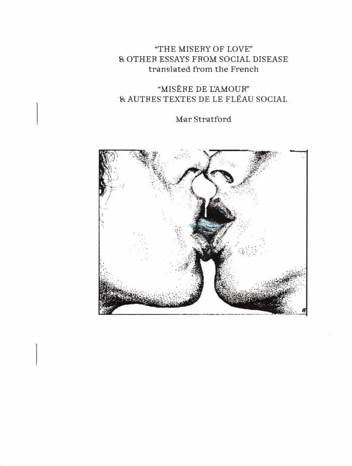
“The Misery of Love” & other essays from 'Social Disease'
From 1972 to 1974, the anonymous writers of Social Disease offered groundbreaking, incisive, and sweeping critiques of social relationships through the lens of Situationism. Arguing that true revolution — the kind of complete and irreversible revolution longed for in the wake of such revolutionary moments as the May 1968 student uprisings and the 1969 Stonewall riots— would change every aspect of society, it was clear that affective relationships — how we love, how we feel pleasure— would necessarily be changed as well, and thus deserved examination as much as the traditional questions of labor or politics. The voices in the essays speak with urgency, and do not compromise in their expression. Beyond the theoretical insights of the text, the emotional truth of history comes through in the spaces of contradiction, and allusions to intercommunity conflicts. These essays were written without constraints for an immediate audience of comrades and peers; with this translation of the collection, that audience now includes us.
"Translating from the French, Mar Stratford's MISERE DU L'AMOUR captures the urgency, passion, and drama of 1970s gay leftism. MISERE DU L'AMOUR asks questions that persist: what does a better world look like? What is the true nature of love? Can we fuck and suck our way to liberation?The questions asked by F.H.A.R in the 1970s have a relevance to today's discourse that Stratford's translation animates. Tell your friends, your lovers, and your haters." —Brendan Williams-Childs
"The Misery of Love" & Other Essays From Social Disease / “Misère de l'amour” & autres textes de le flèau social. Bound with staples. Covers printed on Mohawk off-white cardstock, with front cover image hand colored with pencil and marker. Interiors printed on bright white French text weight paper. Printed and assembled in "Kingston, New York,” the unceded and occupied lands of the Haudenosaunee, Mohican, Munsee Lenape, and Schaghticoke tribes.
Designed by The Aliens.
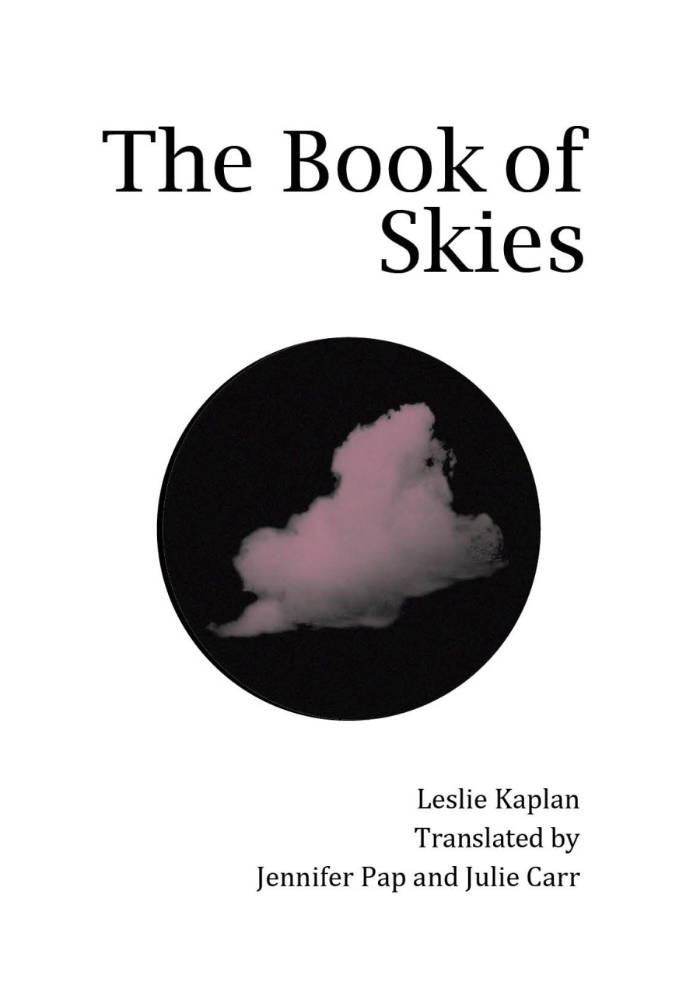
The Book of Skies
Leslie Kaplan, Jennifer Pap and 1 more
The Book of Skies, like its predecessor Excess-The Factory, emerged from poet Leslie Kaplan's experience participating in the national strike and social revolution of ’68 in France. Early in ‘68 Kaplan, like others, left her studies in order to take on factory work, as an aspect of revolutionary practice. Excess—the Factory, puts the factory experience strikingly on the page in sparse and original language. The Book of Skies takes place in the period just after the ‘68 events as the central speaker now observes the places, landscapes, and people surrounding and relying on factory production in French cities, small and large. As the poem’s speaker moves from site to site, she finds possibility within the social spaces of the market, the street, the café, and even the factory itself. While class and gendered violence threaten to shut down hopes for freedom and renewal, the sky, as reality and as figure, functions as an aperture, drawing our attention upward and outward, even or especially when domestic and work-spaces are most violent or suffocating.
From the beginning of her career, French poet, playwright, and novelist Leslie Kaplan has been an important writer of the French left. She has published over twenty books in all three genres, many of which have been translated into German, Swedish, Spanish, Danish, Norwegian, and now, English. Her first book, L'exces l’usine (1982), gained the attention of writers such as Marguerite Duras and Maurice Blanchot, and became an important book for the ‘68 generation. In 2018, Commune Editions published Excess—The Factory, translated by Julie Carr and Jennifer Pap. This was the book’s first translation into English, though it had been translated into five other languages.
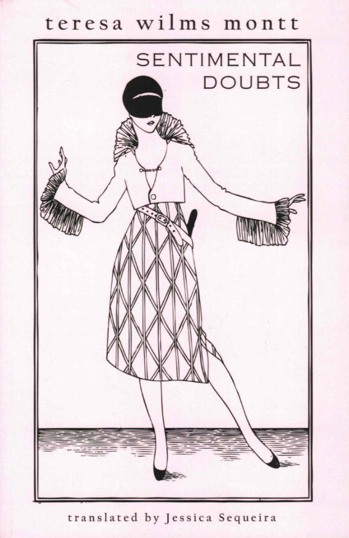
Sentimental Doubts
Teresa Wilms Montt, Jessica Sequeira
Sentimental Doubts, here translated into English for the first time by Jessica Sequeira, was iconic Chilean writer Teresa Wilms Montt’ s first book. It was originally published in 1917, in Buenos Aires, after the author had left an entire life behind her in Santiago: her husband, her parents, the convent where she’d been confined for supposedly committing adultery, and her two daughters, whom she was forbidden from seeing.
In this work, she communicates her “inquietudes”: the racing heart, the muttering mind, the explosion of doubts.
Wilms Montt subverts the religious charge of doubt to turn pain into eroticism, sadness into seduction, doubt into assertion, and there is a great beauty to be found in this restlessness and impressionistic shifting, these temporary glimmers of light on water.
Teresa Wilms Montt was born on September 8, 1893 in Viña del Mar, Chile, into an elite, well-connected family. Her first book, Inquietudes sentimentales, consisted of fifty poems with surrealist features, while her second, Los tres cantos, explored eroticism and spirituality. Both books enjoyed great success in Argentine intellectual circles. In 1918, she moved to Madrid, where she published two works widely recognized by Spanish literary critics: In the Stillness of Marble and Anuarí. Upon returning to Buenos Aires in 1919, she published her fifth book, Cuentos para hombres que todavía son niños. She died in 1921, in Paris, from an overdose of Veronal.
About the Translator: Jessica Sequeira was born in San Jose, California in 1989, and currently lives in Santiago de Chile. Her works include the novel A Furious Oyster (Dostoyevsky Wannabe), and the collection of essays Other Paradises: Poetic Approaches to Thinking in a Technological Age (Zero).
Her translations include Bernardo Couto Castillo' s Asphodels (Snuggly Books, 2020), Enrique Gómez Carrillo' s Sentimental Stories (Snuggly Books, 2019), Rafaela Contreras' s The Turquoise Ring and Other Stories (Snuggly Books, 2019), Adolfo Couve’ s When I Think of My Missing Head (Snuggly Books, 2018), and Liliana Colanzi’ s Our Dead World (Dalkey Archive).