Texts that shouldn't be read out loud
Language: English

Language: English

fanta for the ghosts by Elisabeth Molin
120mm x 210mm
edition of 500
Co-published with OneThousandBooks and Elisabeth Molin

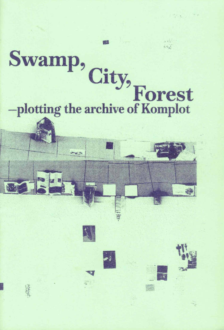
This zine is the result of the research residency "Plotting with the archive" that took place at Komplot between September 2025 and January 2026. The publication contains a subjective timeline of Komplot — its strategies, relations and projects — with the aim of organising them and at the same time speculating on possible future developments. The material was produced during a collective workshop in which the archive was explored and activated.

In collaboration with Laurent Poleo-Garnier, NIGHTNIGHT is an archive of images and texts from different sources addressing the theme of the night. Over the book as a party that degenerates with fatigue, alcohol and other stimulants, images and layout deteriorate, the subjects get tired, the vision is cloudy...

Edition of drawings, paintings and scans by Sophia Hamdouch, wrapped in a vinyl sleeve.

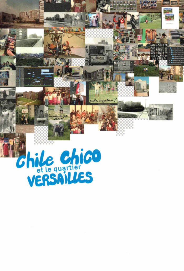
Chile Chico et le quartier Versailles, c'est une exploration qui inventorie, interroge et révèle les mémoires invisibles en listes et en collections. Une mémoire qui ne soffre pas en bloc, qui résiste, se fragmente, se transforme. A travers cette archive collaborative, nous avons voulu capter ces va-et-vient ď'un passé qui dialogue avec le présent, des images qui oscillent entre Vintime et le collectif.
Le point de départ de cette fabrique visuelle, c'est lexil des Chilien.nes, débarqué.es dans les années 70, qui se tissent une nouvelle vie sur le sol de Neder-Over-Heembeek, dans le quartier Versailles à Bruxelles. Ces trajectoires, arrachées à un ailleurs, s'ancrent dans des espaces rêvés comme de transit pour devenir des lieux d 'appartenance, où lexil se mue et les racines finissent par se déployer. A ces récits se greffent d'autres histoires, d'autres trajectoires. Un quartier comme un carrefour, ou les individualités se rencontrent, où les vies se croisent et s'allient.

Somewhere in England, confined to a room with empty chairs and an old telephone, is I. I wasn’t born here. English is their second language. They’ve given up writing. England With Eggs depicts the psychological aftermath of migration through a personal vortex of foreign experiences. Oscillating between narrator and character, Franz Kafka and long-distance calls, I spends sleepless nights drawing eggs, rearranging the chairs and talking to an uncanny voice on the phone. The isolated protagonist’s inner life is fractured: notions of place and history grow ever more fragile, language ever less certain. Torn between stubborn expectations and the reality of a foreign country, England With Eggs unfolds against a silent backdrop of austerity, colonialism and xenophobia. It is a study of acceptance, a reminder that sometimes the things we flee from are the ones we carry along on our journey.
This publication is limited to 100 copies, which are signed and numbered by the author.
Edited by Angie Harms

Child’s Replay is a hallucinatory homecoming. As we follow THE CHILD in a series of private re-enactments, the present self is revealed as the past’s fragile construction. Pursuing the banality of trauma, a first-person character juxtaposes childhood events with internal misrepresentations, reflections on the emotional toll of migration, psychoanalytic theory, Brazilian history, and literary criticism. An exploration of the impact that language and fiction have on real bodies, Child’s Replay assembles a hybrid portrait of memory and anti-memory.
This publication is limited to 100 copies, which are signed and numbered by the author.

Jonas J. Magnusson, Cecilia Grönberg and 1 more
Aeron Bergman and Alejandra Salinas, co-editors at INCA Press (along with Irena Borić), are the guest-editors of this issue of OEI: it contains essays, artworks, and archival materials by 21 artists, theorists, writers, and artist-run spaces (mostly from the Americas).
The subject of the issue is art and neoliberalism, and it encompasses essays, images and other works by Dorothée Dupuis, Max Jorge Hindered Cruz, Luciano Concheiro, Yvonne Osei, Diego Bruno, John Riepenhoff, Suhail Malik, Good Weather, The Luminary, Bikini Wax, Beta-Local and more.