Graphic Design
Graphic Design

Publi Fluor, Letter Business in Brussels
A self-taught typographic letterer, Chrystel Crickx used to cut out letters by hand and sell them by the piece in her Publi Fluor shop in Schaerbeek, Belgium. Commercialized between 1975 and 2000 for local advertising and signage purposes, these letters have since been digitized and made more widely available to users outside of the Belgian borders and in other contexts. At the margins of standard means of communication, they have contributed to shape (and still do) the urban visual landscape, in Brussels and elsewhere.
This non-standard, collective essay attempts both to recount the life of a type model — as well as of its successive authors and their tools — while expanding the field of investigation to examine the cracks between the different stories summoned up by Chrystel Crickx's practice summons up.

Makulatur – 2010-2016
A collection of misprinted sheets originating from books designed by graphic designer Manuel Raeder: a “behind the scene” project, which documents the early stage of book production and its conventions.
Makulatur, a German word that derives from lat. maculatura “something stained”, refers to misprinted paper that is discarded at the beginning of the printing process as use- and worthless. In 2010, the graphic designer Manuel Raeder started to collect and preserve misprinted sheets of all the publications he designed not only for his own publishing house Bom Dia Boa Tarde Boa Noite but also for fellow artists and institutions.
This waste paper that shows all difficulties arising in the early stage of production—trails, testy or stains—he combined to a new volume as a compilation of maculae “stains”. Thus, he dissolved the spoiled material from the realm of invisibility and displays it to the public whereby he reveals and reflects on the conventions of a book.
Graphic designer Manuel Raeder lives and works in Berlin.

Image RIP: After Printing, Work & Planet Earth
Image RIP, the first publication from Source Type, is centered around New York graphic designer Geoff Han’s investigation into the Shenzen-based printer Artron and explores subjects ranging from design, production, work, and the environment in the post-industrial economy. The book gathers essays by Danielle Aubert, David Bennewith, Geoff Han, Ming Lin, Shanzhai Lyric, David Reinfurt, Mindy Seu, and Dena Yago, and features images by Ann Woo. Image RIP reflects a consistent theme in Han’s practice of the manipulation of image reproduction, printing, production, code, and other techniques to affect the process of viewing and reading.

LSD #03 – A DIY Issue
The third issue of Le Signe Design (the Cahiers of the National Graphic Design Center) is about DIY practices and is based on the work of Gilles de Brock, graphic designer who became a ceramic tile manufacturer.
Do It Yourself practices are not, as is commonly assumed, limited to home improvement, nor just a way of subverting—hacking—a given social and political organization. They are also a way of looking both forward and backward, at our future and our heritage. They involve our heritage insofar as they allow constituted groups to revive past knowledge and skills threatened with extinction. They look forward in that they make it possible to create tools that do not yet exist but could.
The applications of the Do It Yourself approach range from niche practices to everything everywhere, and what they have in common is that they are always in opposition to the mass market. Some examples of this extremely diversified movement include self-publishing, cosplay, biotechnology, hacking (especially in the sense of programming), and producing digital artworks and music. Its most mediatized (and often romanticized) contemporary manifestation is what are called fablabs, but this term is too limited to cover the phenomenon in all its vast variety.
The roots of the DIY movement go back to the magazines Popular Mechanics(1902) and Mechanix Illustrated (1928), popular education publications meant for readers in small towns and the countryside who needed to be self-reliant and repair broken manufactured items rather than buying new ones. The late 1960s saw the emergence of movements motivated by environmental concerns and a distrust of consumer society. Many people—like some student co-op members, hippies in North America and punks in Europe—wanted to share resources. Stewart Brand's famous Whole Earth Catalogue, subtitled "Access to tools", launched in 1968, constitutes our contemporary reference.
This issue is appearing in parallel with the solo exhibition retracing the career of Gilles de Brock, whose production is deeply infused with the DIY spirit. Yet his practice can't be reduced to the things he has actually made. It is part of the kind of knowledge-sharing economy proclaimed in Brand's counter-culture manifesto, able to go even further today thanks to the participatory and interactive Web 2.0.
Texts by Pao Lien Djie, Maya Ober, Nina Paim, Anthony Masure, Guillaume Helleu, Tereza Bettinardi, Jean-Michel Géridan.
MsHeresies 4 — Daffodils
Elisabeth Rafstedt, Johanna Ehde
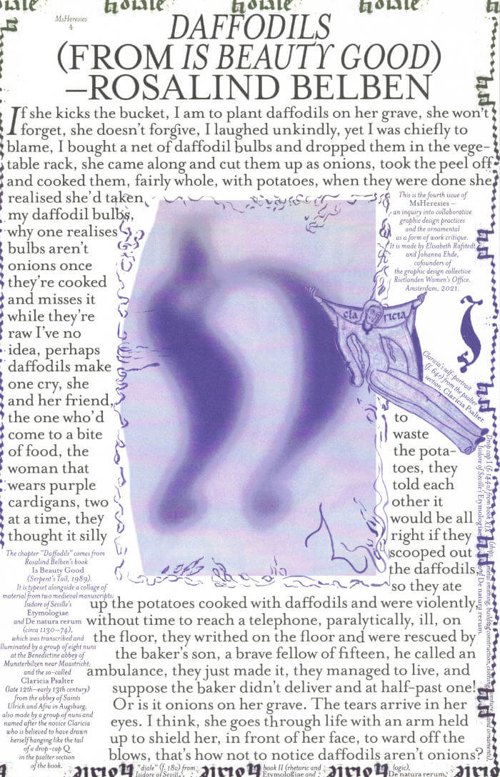
This fourth issue of MsHeresies republishes the chapter *Daffodils* — a warped monologue about a domestic poisoning — from Rosalind Belben’s book Is Beauty Good (1989).
It is typeset alongside a collage of material from two medieval manuscripts: Isidore of Seville’s Etymologiae and De natura rerum (circa 1130–74), which was illuminated and transcribed by a group of eight nuns at the Benedictine abbey of Munsterbilzen in Maastricht; and the so called Claricia Psalter (late 12th–early 13th century) from the abbey of saints Ulrich and Afra in Augsberg, also made by a group of nuns and named after the novice Claricia who is believed to have drawn herself hanging like the tail of a drop-cap Q in the psalter section of the book.

Dear Friend Catalogue 2019-2022
Dear Friend is a monthly letter format publication covering design events, issues, and ideas. This publication distributed via snail mail is initiated by Sandra Nuut and Ott Kagovere.
The publication edited by Sandra Nuut & Ott Kagovere features all the letters from the Dear Friend publishing project, which they initiated at the Graphic Design Department of the Estonian Academy of Arts in 2018. The book includes contributions by Singapore-based design writer Justin Zhuang, designer and writer Else Lagerspetz, and artist Lieven Lahaye. The book is designed by Ott Kagovere and published by Lugemik and Estonian Academy of Arts.
Texts by Justin Zhuang, Lieven Lahaye, Else Lagerspetz
Letters written by Alicia Ajayi, Stuart Bertolotti-Bailey, Claudia Doms, Nell Donkers, Maarin Ektermann, Rosen Eveleigh, Maryam Fanni, Saara Hannus, Eik Hermann, Paul John, Maria Juur, Ott Kagovere, Maarja Kangro, Arja Karhumaa, Kristina Ketola Bore, Nicole Killian, Rachel Kinbar, Tuomas Kortteinen, Keiu Krikmann, Kadri Laas, Else Lagerspetz, Lieven Lahaye, James Langdon, Jungmyung Lee, Kai Lobjakas, Michelle Millar Fisher, Maria Muuk, Sheere Ng, Sandra Nuut, Laura Pappa, Jack Self, Indrek Sirkel, Paul Soulellis, Triin Tamm, Laura Toots, Alice Twemlow, Loore Viires, Sean Yendrys, Justin Zhuang

A New Program for Graphic Design
A New Program for Graphic Design is the first communication-design textbook expressly of and for the 21st century. Three courses—Typography, Gestalt and Interface—provide the foundation of this book.
Through a series of in-depth historical case studies (from Benjamin Franklin to the Macintosh computer) and assignments that progressively build in complexity, A New Program for Graphic Design serves as a practical guide both for designers and for undergraduate students coming from a range of other disciplines.
Synthesizing the pragmatic with the experimental, and drawing on the work of Max Bill, Beatrice Warde, Muriel Cooper and Stewart Brand (among many others), it builds upon mid-to-late 20th-century pedagogical models to convey contemporary design principles in an understandable form for students of all levels—treating graphic design as a liberal art that informs the dissemination of knowledge across all disciplines. For those seeking to understand and shape our increasingly networked world of information, this guide to visual literacy is an indispensable tool.
David Reinfurt (born 1971), a graphic designer, writer and educator, reestablished the Typography Studio at Princeton University and introduced the study of graphic design. Previously, he held positions at Columbia University Graduate School of Architecture, Planning and Preservation, Rhode Island School of Design and Yale University School of Art. As a cofounder of O-R-G inc. (2000), Dexter Sinister (2006) and the Serving Library (2012), Reinfurt has been involved in several studios that have reimagined graphic design, publishing and archiving in the 21st century. He was the lead designer for the New York City MTA Metrocard vending machine interface, still in use today. His work is included in the collections of the Walker Art Center, Whitney Museum of American Art, Cooper Hewitt National Design Museum and the Museum of Modern Art. He is the co-author of Muriel Cooper (MIT Press, 2017), a book about the pioneering designer.

Graphic Design Is (…) Not Innocent
Graphic Design Is (…) Not Innocent questions ingrained approaches, values and assumptions of graphic design in globalized societies. The publication aims to initiate a dialogue between designers, scholars, critics and commissioners, who investigate responsibilities, potentials, politics, limits and risks of designing visual communication. How innocent is graphic design? Whom is it addressing, whom is it in/excluding? What does it bring about? When defining the role and impact of visual communication, what future questions lie ahead?
Contributors: Karo Akpokiere, Christian Bauer, David Bennewith, Friedrich von Borries, Clémentine Deliss, Sandra Doeller, Daniel Martin Feige, Feminist Internet, Annette Geiger, Matthias Görlich, Anna Lena von Helldorff, Martin Ludwig Hofmann, Jianping He, Kay Jun, Anoushka Khandwala, Francisco Laranjo, Degeng Li, Eva Linhart, Madoka Nishi, Ingo Offermanns, Offshore, Sophia Prinz, Konrad Renner (Knoth & Renner), Conor Rigby (Feminist Internet), Isabel Seiffert (Offshore), In-ah Shin (Feminist Designer Social Club), Pierre Smolarski, Markus Weisbeck

Verlag der Buchhandlung Walther König
Every Day is A New Day: Calendar 2023
Dutch graphic designer Karel Martens (born 1939) has been an influential figure in the visual culture of the Netherlands for many decades. Alongside his commissioned projects, Martens has maintained a commitment to this personal and iterative way of printing, which shows how creative practice often spans perceived disciplinary boundaries.
For each day of this elegant 2023 calendar, Martens has created a unique abstracted form to serve as a number—originally constructed using his signature method of printing letterpress monoprints from found metal forms, which are then digitized to comprise 365 compositions in total. The piece’s reference to the daily practice of art expresses Martens’ own approach as a designer and educator: “every day is a new day.”

Visualisation. L'interprétation modélisante
Les diagrammes, cartes et visualisations de données ont conquis le domaine de la recherche en arts, lettres et sciences humaines. Pour certains chercheurs, ces formes graphiques consistent à exploiter des données quantitatives jusqu’ici délaissées, pour d’autres, elles offrent la possibilité d’explorer les relations discrètes qu’entretiennent des corpus hétérogènes. Mais sur quels fondements épistémologiques reposent ces opérations techniques et intellectuelles ? Dans le cadre de la production du savoir et de son interprétation en régime numérique, est-il possible de dépasser le simple effet d’affichage des données, certes bluffant au premier abord, et d’envisager autrement les interfaces et les logiciels ?
Considérée aujourd’hui comme l’une des plus importantes théoriciennes des humanités numériques, Johanna Drucker livre dans cet ouvrage, spécialement rédigé pour la collection, une alternative aux formes dominantes de la visualisation de l’information. Héritière de la tradition humaniste, elle propose une approche qui réhabilite l’idée d’un sujet situé et incarné qui expérimente et conceptualise les connaissances par le prisme de la représentation graphique.

Patterns
This publication contains a collection of patterns designed by Dutch graphic designer Karel Martens. Although Martens is widely recognised for his specialisation in typography, the dozens of full-page patterns shown here are devoid of any text, allowing the sequence to become a mesmerising pattern in itself. Designed by Martens & Martens.

LSD #02 – A Typographic Issue
The second issue of the Cahiers du centre national du graphisme (National Graphic Design Center) is about typography, observed through artistic, cultural, societal, or technical approaches, with a focus on the work of the font designer Jean-François Rey and his exhibition "Typography and comics" at le Signe, centre national du graphisme, by the curator Jean-Noël Lafargue.
LSD 2 opens on history of art and graphic design with the text by Catherine Guiral, the question of "free" fonts studied by Frank Adebiaye, but also publishes an essai on research in the French language of inclusive, not -binary, post-binary or even genderfuck typography practices, by Caroline Dath ° Camille Circlude.
With texts by Frank Adebiaye, Caroline Dath ° Camille Circlude, Catherine Guiral, Jean-Noël Lafargue, Jean-François Rey.
Graphic design: officeabc.
Published in October 2021
Bilingual edition (English / French)
13 x 19 cm (softcover)
224 pages (20 color & 42 b/w ill.)

Design Dedication: Adaptive Mentalities in Design Education
Design Dedication makes a plea for adaptive mentalities within design pedagogy, with a non-normative approach to design practices. It explores an attitude in and towards design education that is socially engaged, politically aware, generous in approach, lyrical in tone, experimental in form and collaborative in practice. How can we talk about and bring out the political that’s inherent in the work that design students are doing? How to work on specific urgencies that are rooted in experience and narration? What are the underlying values of such a pedagogy? What kind of practices are developed in the context? How can an institute support and safeguard this?
Design Dedication explores these approaches through statements from within and reaches out to design students, designers, artists, and teachers who are open to questioning their own practices and reformulating values in design dedication for a yet unpredictable, but surely dedicated tomorrow.
Contributors: Hannes Bernard, Michèle Champagne, Rana Ghavami, Anja Groten, Agata Jaworska, Anastasia Kubrak, Sherida Kuffour, Gui Machiavelli, Daniel van der Velden, Annelys de Vet and many others.

CAPS LOCK
Capitalism could not exist without the coins, notes, documents, graphics, interfaces, branding and advertisements; artefacts that have been (partly) created by graphic designers. Even anti-consumerist strategies such as social design and speculative design are being appropriated within capitalist societies to serve economic growth. It seems that design is locked in a system of exploitation and profit, a cycle that fosters inequality and the depletion of natural resources.
CAPS LOCK uses clear language and striking visual examples to show how graphic design and capitalism are inextricably linked. The book contains many case studies of designed objects related to capitalist societies and cultures, and also examines how the education and professional practice of (graphic) designers supports the market economy and how design practice is caught within that very system.
The content of CAPS LOCK is structured in chapters with titles of professions that designers can occupy (such as Educator; Engineer, Hacker, Futurist, Activist, etc.). These titles respond to the importance of not just how designers make work, but also how they perform daily economic and social roles.
Empathy Revisited: Designs for more than one
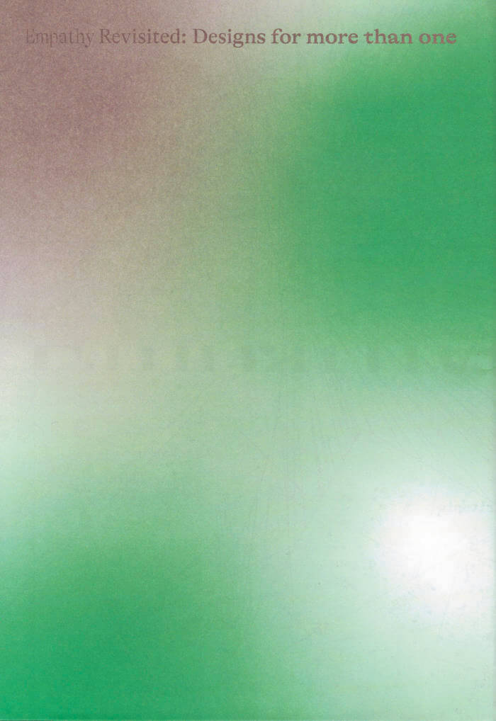
Ideas, utopian propositions and practical solutions for reinterpreting and reconnecting empathically with the world around us.
This book brings together ideas and projects that seek to define a new role for design based on empathy.
As a mediator of emotions and feelings, design is presented here as a practice that takes care as its main purpose. Designers adopt sensitive, diplomatic, sometimes therapeutic functions, with the aim of connecting us with one another but also with the world around us, with other species, with soil, water and even the universe. In this book, the reader will find new ideas, utopian propositions but also practical solutions for reinterpreting and reconnecting with the world around them. Taking food as a key medium of encounter, both between people and also with the more than human world, the designers featured in this book consciously operate in a multi-scalar realm – from the invisible microbial life that lives in our gut to the vast landscapes transformed by agricultural practices. Designs for more than one are those that take into consideration not just their immediate user or client but the many constituents inevitably impacted by any new object or action.
Edited by Mariana Pestana with Sumitra Upham and Billie Muraben.
With written contributions by Ekin Ozbicer, Mariana Pestana, Susan Lanzoni, Naz Şahin, Billie Muraben, Sumitra Upham, FRAUD, Luigi Coppola and Vivien Sansour and Pelin Tan, Aslıhan Demirtaş, Black Athena Collective, theOtherDada, TiriLab, Counterspace, Anna Puigjaner (MAIO) with Alina Abouelenin, Aslı Uludağ, Dele Adeyemo, Young Curators Group, Eylül Şenses, Ulya Soley, Nur Horsanalı, Studio Ossidiana, Orkan Telhan + elii, Ibiye Camp, Ben Thorp Brown, Paula Gaetano Adi, Meriem Bennani, Calum Bowden, Jawa El Khash, Emmy Bacharach, Alice dos Reis, Macedo Cannat, Future Anecdotes.
Revue Faire - Issues 27-30
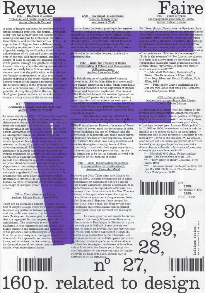
Critical publications dedicated to the analysis of Graphic Design are sadly few and far between today, particularly in France, but also in Europe as a whole.
Adopting an analytical and critical posture with regard to the forms and activities of Graphic Design, Sacha Léopold and François Havegeer established in 2017 a printed publication that deals with these practices. The publication works with eight authors (Lise Brosseau, Manon Bruet, Thierry Chancogne, Céline Chazalviel, Jérôme Dupeyrat, Catherine Guiral, Étienne Hervy and Sarah Vadé).
Revue Faire - Issues 23-26
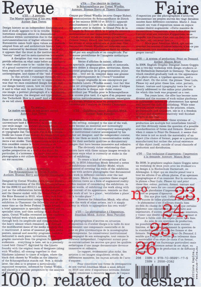
Critical publications dedicated to the analysis of Graphic Design are sadly few and far between today, particularly in France, but also in Europe as a whole.
Adopting an analytical and critical posture with regard to the forms and activities of Graphic Design, Sacha Léopold and François Havegeer established in 2017 a printed publication that deals with these practices. The publication works with eight authors (Lise Brosseau, Manon Bruet, Thierry Chancogne, Céline Chazalviel, Jérôme Dupeyrat, Catherine Guiral, Étienne Hervy and Sarah Vadé).
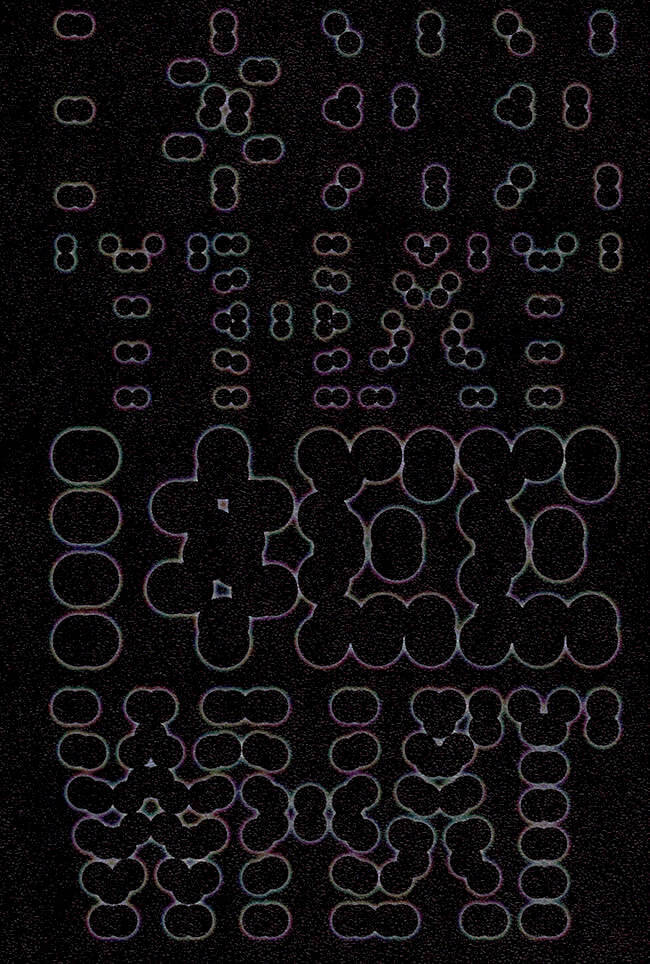
I See That I See What You Don't See
Van Westrenen F., Otero Verzier M.
This “black book” published by Het Nieuwe Instituut presents a layered, non-binary notion of darkness. Navigating through cosmic, automated, and seemingly invisible environments, it delves into what we do not generally get – or choose – to see. Moreover, the book explores the relation between the possibility of seeing and forms of oppression and emancipation.
Contributions by the Academy for Urban Astronauts, Ramon Amaro, Danilo Correale, Jonathan Crary, Aldo van Eyck, Ludo Groen, Bregtje van der Haak, Saidiya Hartman, Marten Kuijpers, Momtaza Mehri, Melvin Moti, Lucy McRae, Johannes Schwartz, Dirk Sijmons, and Leanne Wijnsma.

Sisters of the Wind
Sisters of the Wind is the fruit of artistic research on witches, ecofeminism, and science-fiction carried out between 2018 and 2021 by Juliette Lizotte aka jujulove. It is a story that weaves through seven videos and can be experienced in different ways: an interactive audiovisual performance, an online world-building workshop and role play session, and this publication!
The publication concludes the three world-building workshops and role play sessions part of the project which took place online in February 2021 due to the COVID-19 pandemic, though they were originally intended to unfold in the form of live action role play (larp). This new constraint led us to perform the worldbuilding and role play exercises in an etherpad, an open source digital tool for co-writing text in real-time. The outcome of these sessions was archived and used as material for the publication.
This "choose-your-own adventure" story consists of three parallel worlds that were co-created during three sessions, each lasting three hours. The core of the story was similar, but the direction the sessions took were quite unique. As the story unfolds, you are asked to make decisions to travel from one world to another: creating your own version of the story by following your instinct or challenging your impulses!
Sisters.°·
The wind is returning, as it always does. Sometimes it blows so hard that it carries artifacts away from the cities it tore apart, seeds from far away places, trees that didn’t have enough time to grow stronger... That’s why you always seek a protected area to settle in, relocating as the wind comes and goes in waves. You are witches. You pay attention to the world and try to make sense of this life together through the phases of the moon from maiden to mother to crone. In your community, the feminine spirit dominates, and all gender expressions are celebrated. When your precarious life is threatened by an unsettling prophecy announcing a deadly wind that will prepare the earth for a new cycle, will you go on a journey to find the source of this wind? What will you discover on the way? How will this transform you, your sisters, and the earth forever?
Edition of 100 published by Office of Metaphors, printed in Riso in May 2021 in Amsterdam.

Mamma Rassise No.3
Écrire comme être un chiton, c'est à dire de soi extraire la soie chitineuse. Les squames calcaires exsudés de son fragile : des miettes d'écailles et de spicules tapissent un devenir-mollusque. Au dedans mouolles mais affamé.es, brouteur.euses bestial.es à l'aube de grignotage ; il y a de quoi gratter !
avec les textes de Leo Go, moilesautresart, Marine Forestier, Suzette Haden Elgin, Ninoa André, Valentin Godard, Lucas Lazzarotto, GPT-3 soua la houlette de Guilluame Seyller; et les dessins de Patricia Lino Dias, Alix Penon.

Adrian Piper: Necessary Questions
Consisting of an internal report written by conceptual artist and philosopher Adrian Piper in 1998, Necessary Questions takes Wellesley College, Massachusetts—where she was then on staff—as a case study in institutional racism and neglect. As such, the report could be read simply as an administrative document, though one drenched in meticulously clear advice that could still be, despite being written twenty-three years ago, taken up on a glaringly universal level. Yet the role the report went on to play in Piper’s life proves it’s not just a context-specific document, but an all-too-real example of exactly what it stood against: the ways in which the langue of protocol and the false façade of civility are utilised as tactics to ensure that one stays in their place.
It is the third title from Unbidden Tongues, a series edited by Isabelle Sully that focuses on previously produced yet relatively uncirculated work by cultural practitioners busy with questions surrounding civility and civic life—particularly so in relation to language.

Ruth Wolf-Rehfeldt: Introverse Arrangements
Introverse Arrangements is centred on the work of German artist Ruth Wolf-Rehfeldt who, despite only recently garnering attention for her work, is most known for a period of geometric and poetic typewriter drawings produced between the 1970s and 1990 while employed as an administrator for the German Democratic Republic.
It is the first title from Unbidden Tongues, a series edited by Isabelle Sully that focuses on previously produced yet relatively uncirculated work by cultural practitioners busy with questions surrounding civility and civic life—particularly so in relation to language.
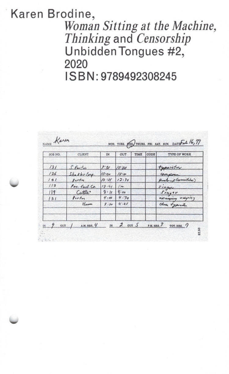
Karen Brodine: Woman Sitting At The Machine, Thinking And Censorship
Woman Sitting at the Machine, Thinking and Censorship is a two-part collection of poems by typesetter, activist and poet Karen Brodine. First published posthumously in 1990 as a reflection on her life as a typesetter, union organiser and lesbian, this series of ‘work poems’ chronicles labour struggles, both personal and collective, and draws on her experience growing up surrounded by socialist feminists immediately following the wrath of McCarthyism.
It is the second title from Unbidden Tongues, a series edited by Isabelle Sully that focuses on previously produced yet relatively uncirculated work by cultural practitioners busy with questions surrounding civility and civic life—particularly so in relation to language.
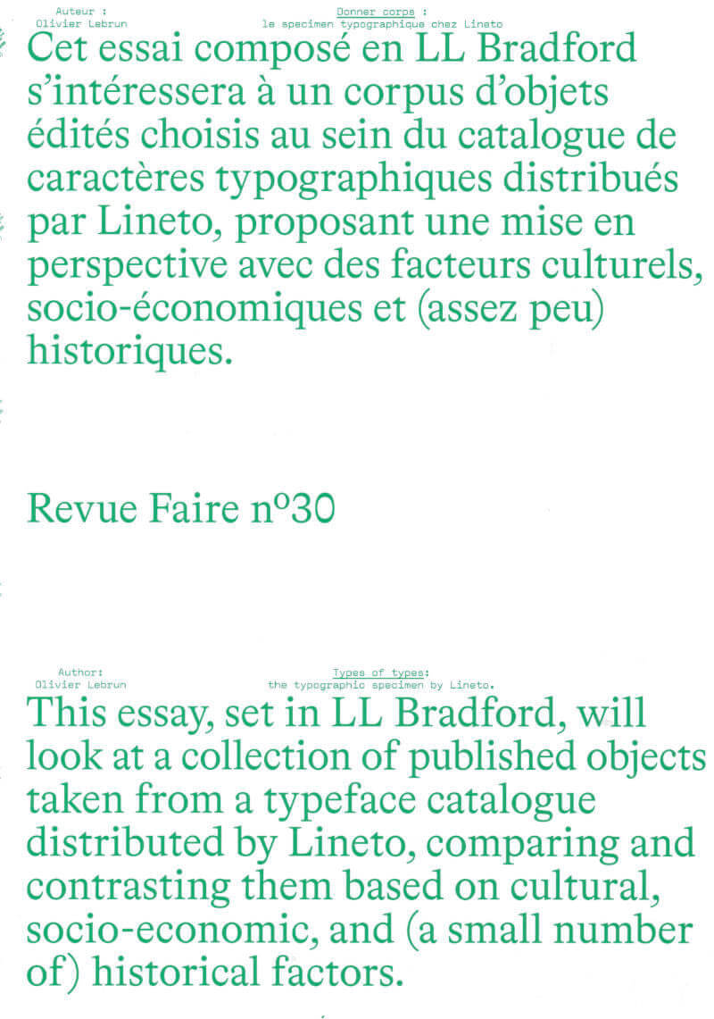
Revue Faire n°30: Types of types: the typographic specimen by Lineto
For Lineto (https://lineto.com) the Specimen plays out through forms and formats in order to promote the foundry’s typefaces: books, posters, envelopes, pamphlets, letter transfers, print ads, and video clips as well as inflatable structures and bootlegs of logotypes. When Reala published LL Biff in 2000, the specimen employed graffiti culture and its modes of distribution, along with a combination of two references: “Medium is the message”*, “Style is the message”**. For Lineto the citation is a form that allows them to distribute their typographic catalogue while promoting diverse cultural fields: “Ignorance of your own culture is not considered cool!”***
* — Marshall McLuhan, Understanding Media: The Extensions of Man, 1964
** — Tony Silver and Henri Chalfant, Style Wars, 1983
*** — Print ad for Lineto published in Dot Dot Dot #16, 2008 that cites The Residents, Duck Stab Poster, 1978