Self-Published
Self-Published
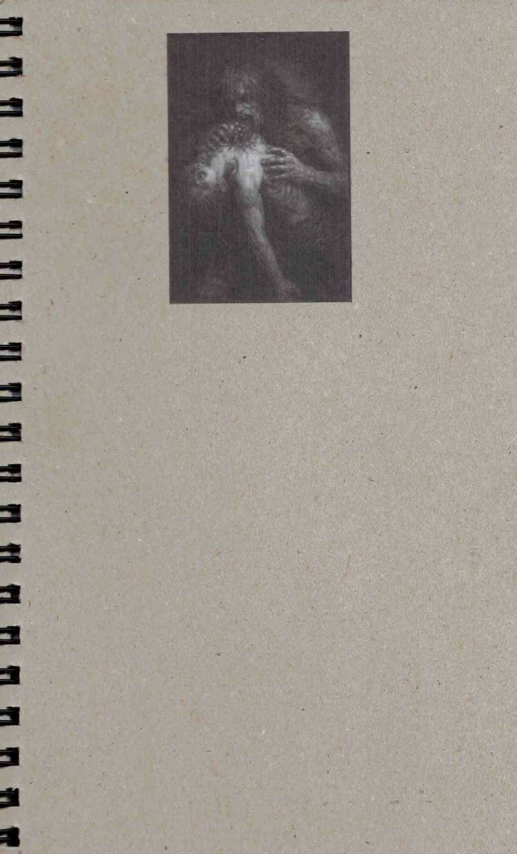
A Psalm for the Third Wind
Book: 11.7 × 18 cm
Book and Glove: 13.5 × 31.5 cm
Presented in a monster glove
Three broken halves of one god walk a city that wants them dead
Their bodies speak in static hunger and rust
Something follows breathing through their mouths
Read it Bleed from it
In A Psalm for the Third Wind, a film script written from 3 perspectives, Damien Troadec is aiming to address in parallel narrative the struggle of having multiples inner voices and the danger of following their distinct desires. One question is raised without any light at the end of the tunnel, confronting the reader to a conflict : THE COMFORT OF MISERY OR THE PAIN OF CHANGE ?
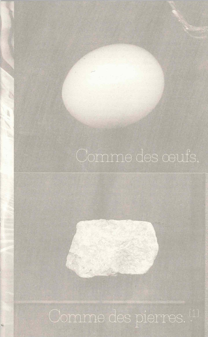
Comme des œufs, comme des pierres
Dans l’imaginaire collectif, l’œuf évoque la fragilité et la promesse de vie, tandis que la pierre renvoie à la permanence et à la disparition. Cette édition tente de déplacer cette opposition à travers une forme fragmentaire. Il rassemble des notes écrites au fil du temps. Sa production suit cette logique : imprimé en offset, le projet prend en compte les formats de papier afin d’en optimiser l’usage. Les chutes sont utilisées dans un cahier complémentaire, rassemblant textes et images laissés en marge. La reliure, cousue à la main au fil de coton, reste simple et légère. L’objet se conçoit comme quelque chose à manipuler et découvrir, entre publication et transmission plus intime.
« J’ai donc cherché une forme simple, en évitant tout formalisme superflu. Le projet repose sur une question : est-il nécessaire de produire ce type d’objet, et pourquoi ? »
In the collective imagination, the egg suggests fragility and the promise of life, while stone evokes permanence and disappearance. This edition seeks to move beyond this opposition through a fragmentary form. It gathers notes written over time. Its production follows the same logic: printed in offset, the project takes paper formats into account in order to optimize their use. Offcuts are used in a supplementary section, gathering texts and images left aside. The binding is hand-sewn with cotton thread, remaining simple and lightweight. The object is conceived as something to handle and discover, between publication and a more intimate form of transmission.
“So I sought a simple form, avoiding unnecessary formalism. The project rests on a question: is it necessary to produce this type of object, and why?”
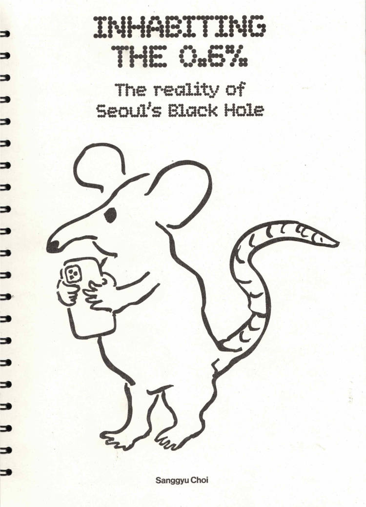
Inhabiting the 0.6%: The reality of Seoul's Black Hole
Cette édition documente la surpopulation de Séoul et les statistiques tragiques qui s'y rapportent. Elle rassemble les voix de ceux qui y vivent, de ceux qui y ont vécu, de ceux qui doivent s'y rendre et de ceux qui l'ont quittée. La production suit les principes écologiques énoncés par la graphiste, Sara de Bondt en 2014. Pour éviter le gaspillage, des formats standard (A4) et du papier 100% recyclé ont été choisis, avec une impression en risographie. Pourquoi cet exode massif vers Séoul ? Comment Séoul est-elle devenue un trou noir ?
This edition documents Seoul’s overpopulation and the tragic statistics associated with it. It gathers the voices of those who live there, those who have lived there, those who must travel there, and those who have left. The production follows the ecological principles set forth by the graphic designer Sara de Bondt in 2014. To avoid waste, standard formats (A4) and 100% recycled paper were chosen, with an impression in risography. Why this massive exodus toward Seoul? How has Seoul become a black hole?
[KO] 이 책은 서울의 인구 과밀화와 이와 관련된 비극적인 통계들을 기록한다. 서울 거주자, 과거의 거주자, 가야만 하는 자, 그리고 이방인까지. 이들의 목소리를 인터뷰로 담았다. 2014년 그래픽 디자이너 사라 드 본트가 제시한 생태적 원칙을 따라 A4 규격 사이즈의 100% 재생용지 위에 리소그래피로 인쇄되었다. 왜 모두가 이토록 서울로 몰려드는 것일까? 서울은 어쩌다 블랙홀이 되었을까?
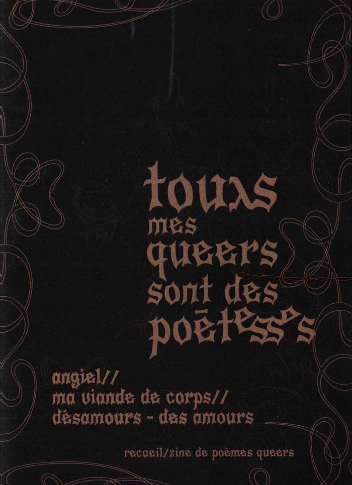
touxs mes queers sont des poéte·sses
Car archiver nos écrits et nos paroles n'a jamais été aussi important, car il faut rendre compte de nos existences, de ce moment, pour nous et pour les futurs queers en recherche de repères oui, nous avons écrit, donc oui vous pourrez écrire aussi ! oui, nous avons existé, donc oui, vous existerez aussi ! car oui, nous sommes toustes poéte·sses ! car nos vies sont des poèmes et être queer est de la poésie car touxs mes queers sont des poéte·sses!
Because preserving our writings and our words has never been more important, because we must bear witness to our lives, to this moment, for ourselves and for future queers in search of guidance yes, we have written, so yes, you can write too! yes, we have existed, so yes, you will exist too! because yes, we are all poets! because our lives are poems and being queer is poetry because all my queers are poets!
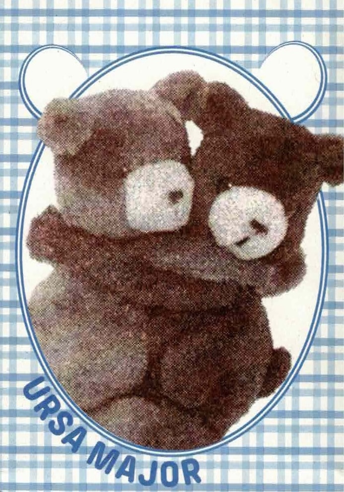
Ursa Major
Ce jeu memory invite à découvrir la symbolique de l’ours à travers l’Histoire, et plus précisément à travers l’histoire de l’ours en peluche. L’animal n’a pas toujours eu bonne réputation chez les humains. Comment un jouet à son effigie a-t-il pu devenir un emblème de l’enfance ? Le jeu se compose de 54 cartes numérotées (27 paires) et d’un poster explicatif imprimés en risographie.
This game of memory is an invitation to discover the symbolism of the bear through history, more specifically, through the history of the teddy bear. The animal didn’t always have such a good reputation among humans. How could a toy in his likeness become an emblem of childhood ? The game is made of 54 numbered cards (27 pairs), and an explanatory poster printed in risography.
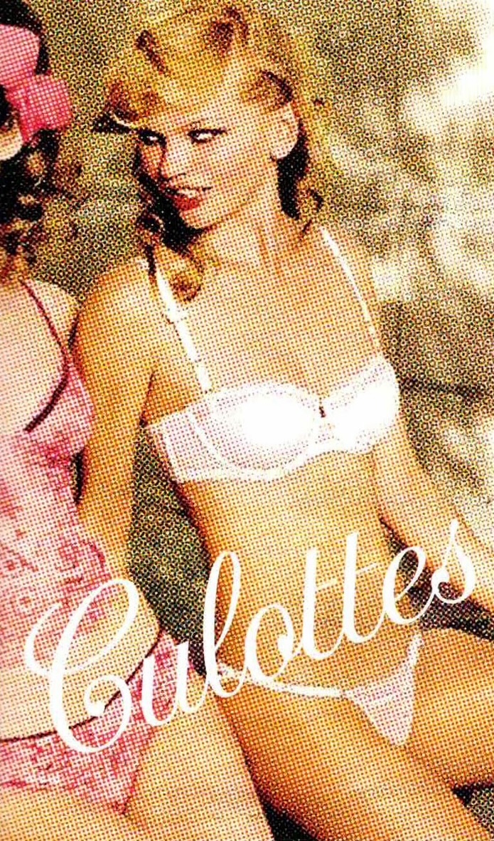
Culottes
Culottes est une édition qui retrace l’histoire de ce sous-vêtement à travers différentes matières textuelles et visuelles. Elle interroge sa symbolique dans un milieu artistique et explore le rapport des femmes à cet objet de leur quotidien. Le tout est accompagné d’images emblématiques de pub et de goodies !!
Culottes is a publication that traces the history of this underwear through different textual and visual materials. It questions its symbolism in an artistic context and explores women’s relationship to this everyday item. It comes with iconic images from advertisements and goodies!!
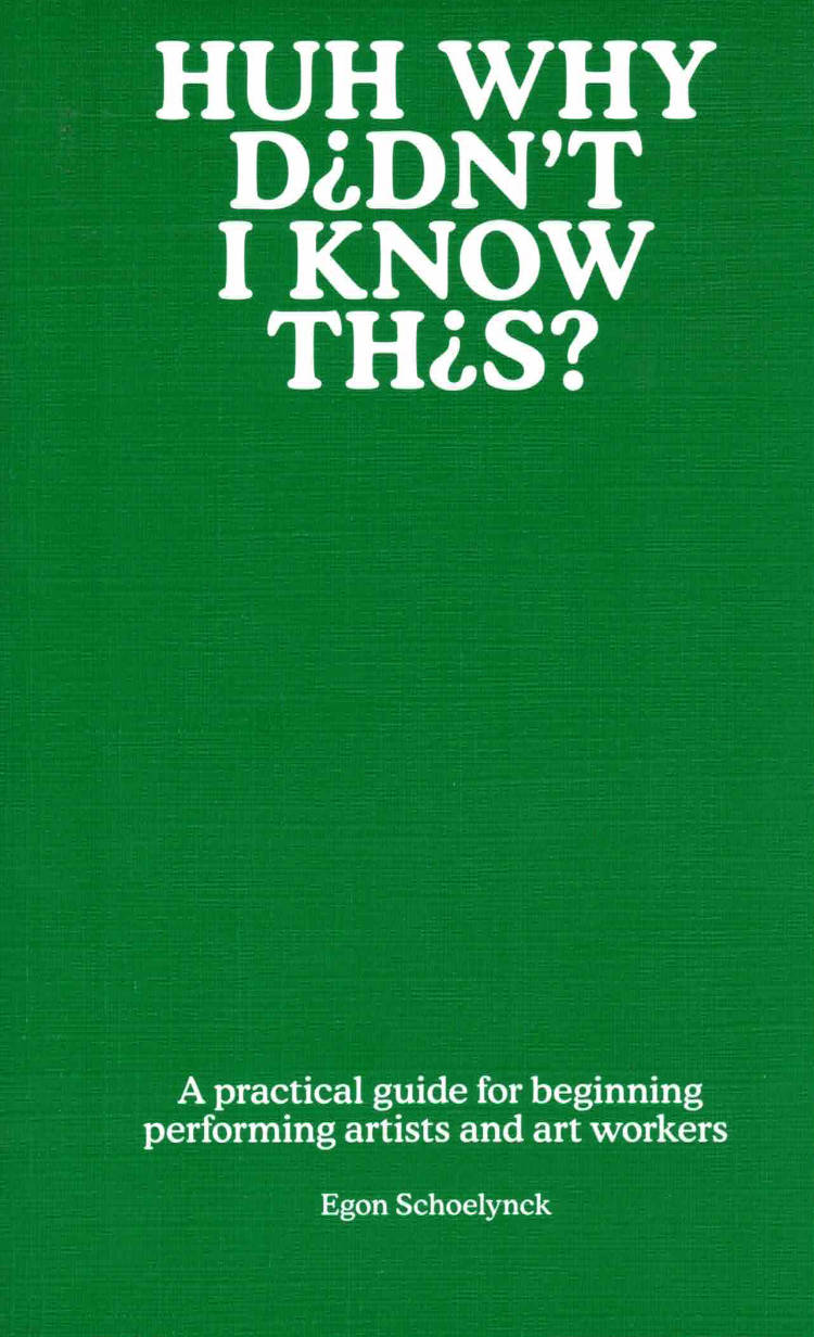
HUH why didn't I know this?
“Sometimes I find myself explaining to someone at 2 a.m. what a subsidy is. Or how train tickets become cheaper if you have the increased allowance – and what that is exactly. Or in which months you should email a cultural centre if you want to sell a performance. Then those people often say: “Huh, why didn’t I know this?” And: ‘Why isn’t all this just explained somewhere in simple words?’
So I started writing it myself. Because I had to figure these things out myself as a new creator, I can speak from experience. I know better than Kunstenpunt or Cultuurloket what a starting creator struggles with, because I’ve only been doing this for a few years myself. I can explain it better because some things in practice are quite different from the theory.”
Egon Schoelynck (he/him, 1996) is a Sunday child and theatre maker. His work is political-ish and can be found in black boxes, on paving stones and in collective collaborations. His artistic practice was supported by detheatermaker (’22-’25), where he explored, among other things, how to run a soap opera in a café without actors. Together with Runa Robbroeckx and Lennert De Vroey, he created KAK, an ecological shitshow (2025). He also solves global problems with punk songs and children’s instruments, under the name Middle Class Babypunk.
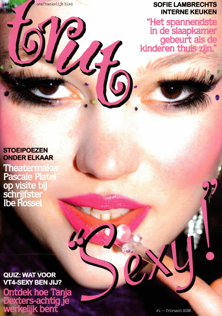
TRUT #1 : De Sexy Editie
TRUT is een exclusief fysiek print-magazine, humoristisch en cultuurkritisch, met een focus op de groteske campness van (Vlaamse) popcultuur. Met bijdragen van meer dan 20 jonge makers trachten ze popcultuur-curiosa opnieuw tastbaar te maken.
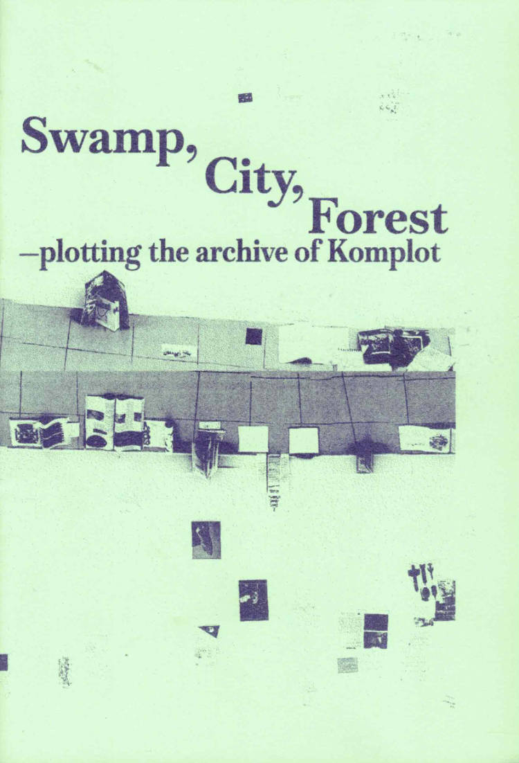
Swamp, City, Forest
This zine is the result of the research residency "Plotting with the archive" that took place at Komplot between September 2025 and January 2026. The publication contains a subjective timeline of Komplot — its strategies, relations and projects — with the aim of organising them and at the same time speculating on possible future developments. The material was produced during a collective workshop in which the archive was explored and activated.
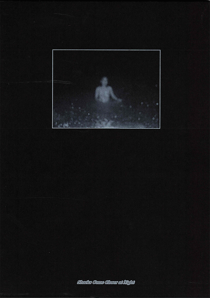
Sharks Come Closer at Night
Sharks Come Closer at Night explores the bond the photographer Lauranne Leunis formed with friends during a first experience far from home. It becomes an intimate reflection on the sacred space they created during their evening walks. In these moments, they found solace in one another while navigating the challenges of young adulthood and the complexities of femininity. The work aims to slow down time, capturing moments of vulnerability, freedom, and connection. Yet even in the stillness, the persistent sound of crashing waves and splashing water serves as a reminder that time is always moving.
All photographs are made on analogue black-and-white film, using various camera formats. This approach adds a raw, fleeting quality to the images, distinguishing them from more staged photographs.
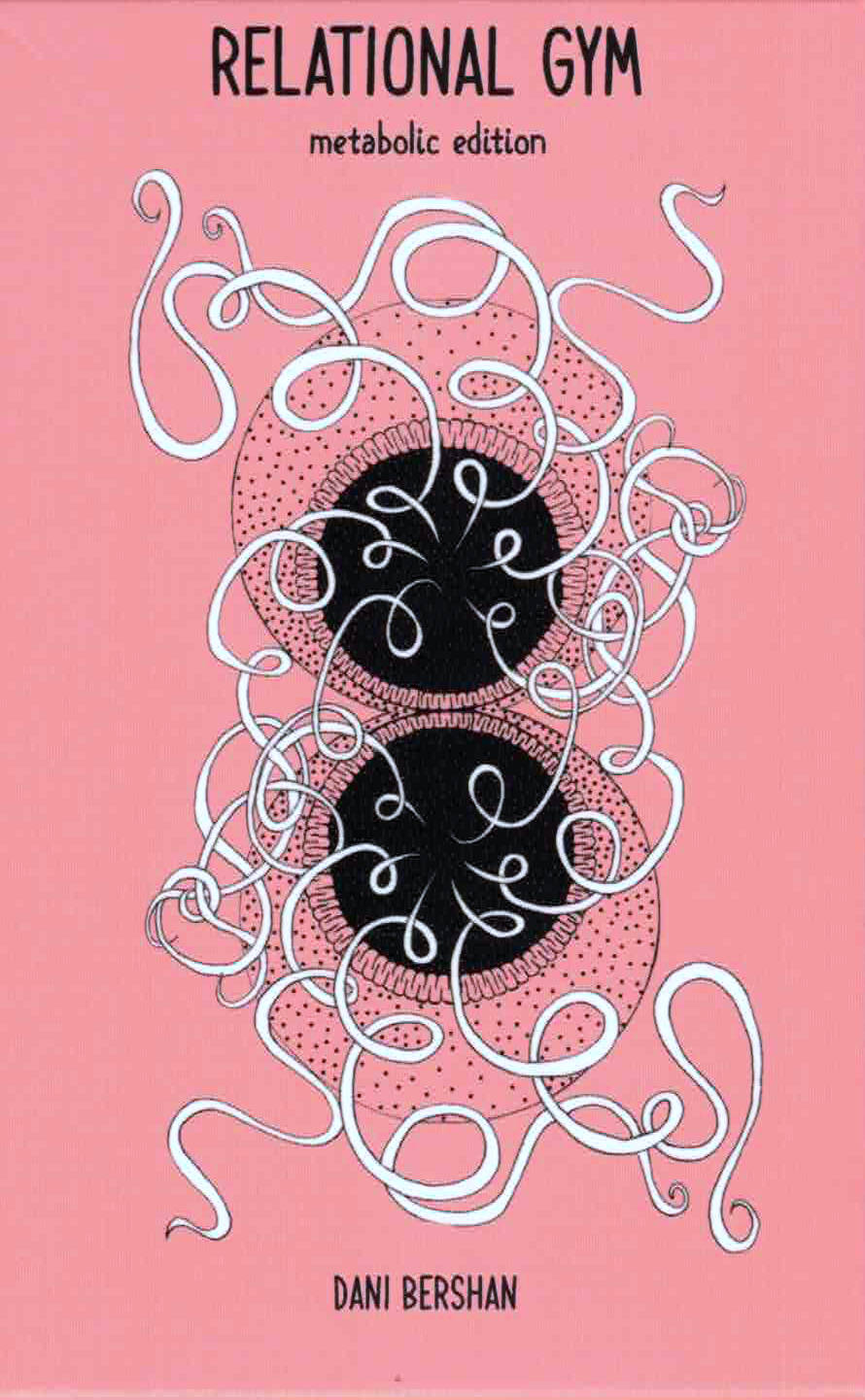
Relational Gym - metabolic edition
This deck is a ritual technology for metabolizing what is happening in the world — and the world is burning, flooding, choking, grieving, starving, birthing, emerging.
Here, metabolism is not just digestion. It’s a political act. A refusal. A prayer. A practice of remembering that every breath, every bite, every boundary, every breakdown is a site of relation — and that relation is never neutral.
This deck does not offer escape. It offers entanglement. It offers deep compost. It offers the sacred mess of staying with the trouble in a world that teaches us to numb, sever, consume, and forget.
It asks: What are we absorbing? What are we excreting? What are we ready to transform — personally, collectively, cosmically?
Use it when you feel cracked open. Use it when you feel sealed shut. Use it as ceremony, as salve, as companion, as agitation. Draw a card. Let the questions move you. Let the images sit on your mucosa. Let the reflections metabolize slowly — in the gut, in the fascia, in the field.
Each card invites you to remember that your body is not separate from Earth’s body. That your breath is not yours alone. That healing is not a return to purity, but a layered, leaking, entangled becoming. There is no clean air. No clean grief. No clean soil and no clean politics. Only deeper sensing, slower noticing, more compassionate worlding and a thousand and one chances to recommit to aliveness — again and again. Let rot what needs rotting. Let feed what needs feeding.
A 39-card oracle deck + 52-page booklet.
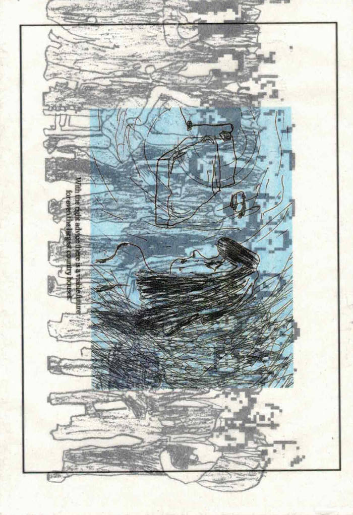
Real Estate Portfolio
Real Estate Portfolio by Claire Barrow
7 panel concertina + covers / total of 16 pages
9.6 × 14 cm folded / 98 cm extended
Riso 250gsm recycled offset exterior, litho 135gsm recycled offset interior
Glassine sleeve, digitally printed on the front & back
Self-published edition of 300, signed by the artist
Constructed in the UK (£0.016 per cm²)
The zine was drawn in one session using the right wrong hand.

Civilization #7
Richard Turley, Lucas Mascatello
The occasionally-published broadsheet Civilization was founded in New York in 2018 by Richard Turley, Lucas Mascatello, and Mia Kerin. Its origin was as a response to New York City life, but has now transformed into an art project that gathers language, overheard conversations, secret recordings transcribed by rapid-capture software to produce a dense, rhythmic assemblage of texts from both public and private spaces alike. As a result, Civilization’s design texture has found fans in the fashion world, leading to collaborations with Calvin Klein and Junya Watanabe.
The publication has also enjoyed contributions from a wide array of artists, writers and personalities including: Aaron Maine, Alis Atwell, Amos Poe, Amalia Ulman, Aria Dean, Alicia Novella Vasquez, Bill Drummond, Biz Sherbert, Babak Radboy, Carly Busta, Darcie Wilder, Echo Wu, Ella Plevin, Eric Johnson, Honor Levy, Iris Luz, Mel Ottenberg, Isabelle Rea, Joey LaBeija, Jordan Barse, Lovefoxx, Maddie Quinn, Patrick McMullan, Rachel Rabbit White, Sybil Prentice, Thom Bettridge, and Zans Brady Krohn.
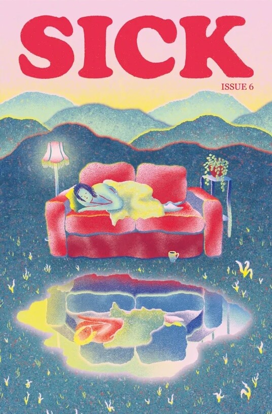
Sick issue 6
Writing on the fragmentation of chronic illness, why ‘full access’ isn’t something arts venues should aim for, the complexities of receiving gender-affirming care while living with chronic illness, the realities of constantly having to ration your energy, an interview with musical artist Dead Gowns, abortion access and bodily autonomy, poetry, artwork, book recommendations, and much more.
Essays, features, poetry, art, interviews & more from Vida Adamczewski, A/Bel Andrade, Amy Berkowitz, Khairani Barokka, Jax Bulstrode, Sarah Courville, Jen Deerinwater , Amy Dickinson, Mizy Judah Clifton, Alton Melvar M Dapanas, Dead Gowns, Sergey Isakov, Theo LeGro, Elias Lowe, Cathleen Luo, Jameisha Prescod, Olivia Spring, Leigh Sugar, Oriele Steiner, Emerson Whitney, Chantal Wnuk, Caroline Wolff, and Emma Yearwood
SICK is an independent, thoughtful magazine exploring illness and disability, founded & edited by Olivia Spring and designed by Kaiya Waerea. Founded in Norwich, UK in 2019, we are currently based in Maine, USA and London, UK. We typically publish one issue per year.
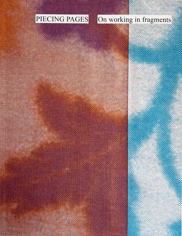
Piecing Pages
Piecing Pages is a (visual) reader which collects the work of fifteen artists, writers and designers across twelve contributions. Each contribution offers insights into a practice or research project that in some way embodies the notion of working in fragments. Together, these contributions unravel how a traditional women’s craft technique continues to influence and inform the fragmented working methods of designers, artists and writers today.
With contributions by Asefeh Tayebani, Hanka van der Voet, Jess Bailey and Sharbreon Plummer, Joke Robaard, Linda van Deursen, Lucy R. Lippard, Melissa Meyer and Miriam Schapiro, Rietlanden Women’s Office, Ronja Andersen, Rosita Kær, Susu Lee and Youngeun Sohn
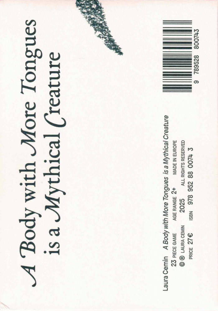
A Body with More Tongues is a Mythical Creature
A Body with More Tongues is a Mythical Creature is a small publication accompanied by a set of playing cards. It builds upon Paper Notes and Pinecones, a solo exhibition I presented in May 2024 at HAM Gallery, Helsinki, and marks the culmination of my research into how living in a foreign country reshapes the way we move and physically relate to the world around us.
Contributors: Chen Nadler, Daniela Pascual, Francesca Berti, Giorgio Convertito, Giorgia Lolli, Isabella Covertino, Tashi Iwaoka, and others
Edited by: M. Winter
Music by: Jenny Berger Myhre
Illustrations by: Valentina Černiauskaitė
Design by: Ran-Re Reimann
Supported by: Kone Foundation, Nordic Culture Point, and the Finnish Art Society
There Is in the Kitchen
Charlotte Koopman has run a kitchen for the past 15 years and has always responded to both crises and festivities by cooking. ‘There Is in the Kitchen’ is a look at how to begin writing, which turns out to be not that different from preparing a meal. Both are prose bordering on poetry, both speak in a multitude of languages.
‘There Is in the Kitchen’ is a series of essays, an inventory of what coexists in the kitchen, a larder stocked with particular interests. Ranging from the singular- Mandarino Tardivo di Ciaculli or Pistacia Terebinthus to the expansive- the cross- rhythm, close encounters, seasonality.
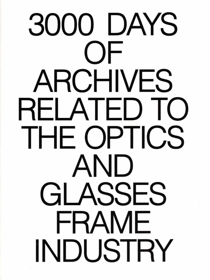
3000 Days of Archives Related to the Optics and Glasses Frame Industry
3000 Days of Archives i a visual journey through the forgotten corners of the eyewear industry. Some untold stories, brands, objects, and people who shaped its evolving landscape. The collection was started in 2018 by the Bidules team, it is an ongoing project, taking no claim to meaning, blending scanography and photography to explore fragments of a trade shaped by time, chance, and memory.
The publication was developed under the creative direction of Mathys Dos Santos, a 23-year-old Brussels-based photographer with a focus on archival storytelling and small print-run publishing. Published by Bidules, the book is a testament to the richness of forgotten material culture, placing itself at the crossroads of visual culture, industrial design, photography and archival research, documenting a lesser-known sector of the eyewear history through a curated lens.
Creative Direction: Mathys Dos Santos
Graphic Design: Mathieu Teissier, Mathys Dos Santos
Photography: Mathieu Teissier, Mathys Dos Santos
Scanography: Mathias Robert, Mathieu Teissier,
Mathys Dos Santos, Nicolas Musty
Texts: Adriana de Chavagnac, Nicolas Musty
Proofreading: Lilou Angelrath

Life with Fifi
Kris Dittel, Angelica Falkeling
A children’s book without a specific age category, offering a glimpse into the small rituals and shared moments that shape a day with Fifi Paris.
Fifi, a Pomeranian-Chihuahua mix, came into the lives of Angelica and Kris a few years ago. Taking care of a puppy is taking responsibility for building their world and letting the small animal transform yours. As her human caretakers, the authors created Fifi’s world with toys, cuddles, rules, snacks and walks in the park. In return, she transforms our world by bringing our community together and reminding us of the importance of caring for one another. In this book, Kris and Angelica narrate a day in the life of Fifi, from the moment she wakes up to when she falls asleep at night. Along the way, they share how they connect with her, how they see her understanding her surroundings and what she has taught them about companionship.
Design by Amy Suo Wu
Copy-editing by Clem Edwards
Photography by Lili Huston-Hertreich

Dyke Affair Vol. 1
Issue 01 is an A5 collection of essays, journalism, poetry, illustrations, and photography by Dyke contributors all over the world.
With contributions by Louise Dalgleish, Ráitseach (Alyssa Delahan Meade), Hex Coles, Kenoya Musa, Megan O’Driscoll, Olive Franklin, Inés Pesado Catrufo, Karla Lamb, Eva Kelly, Celina Jiménez, and others.
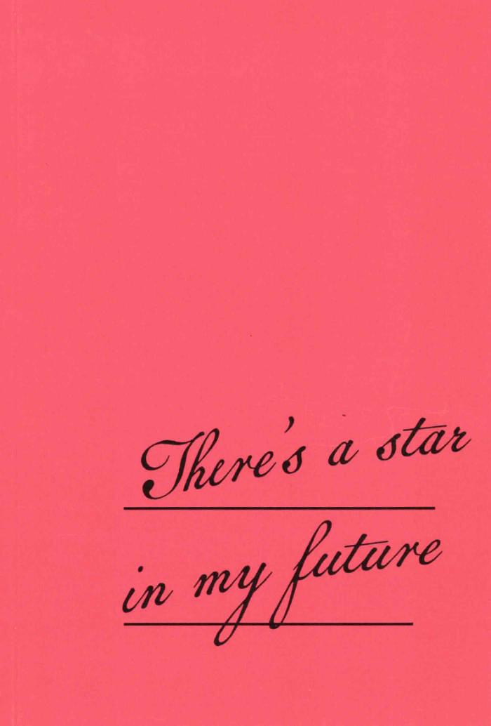
There's a star in my future
There’s a star in my future, catalog of the eponymous exhibition, curated by Mélodie Sylvestre & Zélie Péguillan
With contributions by Alice Payan, Amal Guichard, Ariane Kiks, Astrid Vandercamere, Dominique de Groen, Indigo Deijmann, Irma Vape, Léa Mainguy, Mélodie Sylvestre, Molly Soda, Pauline Baudoux, Zélie Péguillan
Graphic design : Poline Maréchal
100 copies, 200 x 137 mm

Why I Failed in Porn
This book follows my journey of launching, growing, and ultimately failing in the adult entertainment industry. It explores society’s complex relationship with porn and sex education, the challenges of entrepreneurship, and the struggles of working in a deeply stigmatized space. Sometimes funny, often dramatic, and always surprising, it offers an unfiltered look at the business side of porn and what it really takes to challenge the status quo.
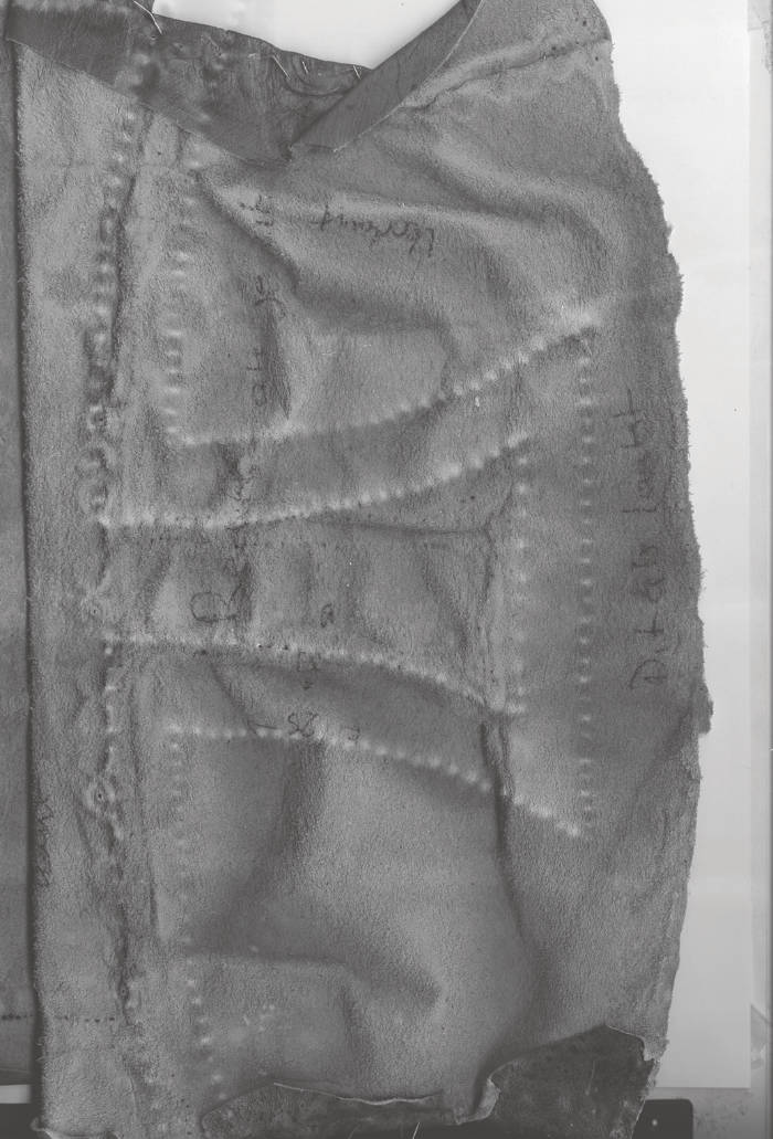
Teenage Lightning: Cinematic Apparatus On Humanly Perception
The book explores how we experience perceptual dissociation and deep immersion when engaging with screen media. Drawing from perspectives such as media criticism, psychological states, and the evolution of visual technology in cinema, it examines how our senses respond to screens. A central theme is the reconsideration of animism—the belief that objects or images possess life—as a fundamental, primitive form of cinema. The work also reflects on the relationship between light and the screen, integrating my own artistic practice in film, light, and interactive media.
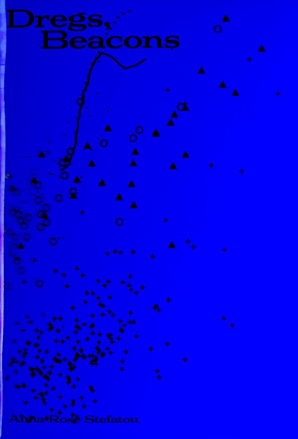
Dregs, Beacons
Poems on light and remnants. Light as mordant, as acid that etches through surface, as something that wraps itself around and between things, revealing form. The writing touches on dregs, remnants, residue and how we make sense of them, by making constellations and navigating through those diagrams.
Anna-Rose Stefatou (b.1996, Athens) is a Greek-British artist based between Athens and London, working between moving image, installation, photography, and writing. Stefatou’s interdisciplinary works attend to stories attached to place and beginning to exist through writing, whether they become a structure to hold it, or whether language simply runs through them. Language is used both as an outset and as a distillation mechanism for ideas, with materials and imagery in visual works responding directly to the text. Gathering and repositioning knowledge guides her creative process: research includes archival footage, taking interviews, collecting objects, and location visits. This process is made visible through her material approach to the photographic image, transformed through different materials, forms and uses, as it unfolds and re-invents itself within new contexts. Stefatou graduated from the Slade School of Fine Art in 2019. Recently, she undertook a residency at Hospitalfield House, Scotland in 2023. Upcoming projects include an exhibition at Pharmakeion, Athens in 2025 as well as a publication Dregs, Beacons that will be realised in 2025.