rile*books

Search books

Search books by title, author, publisher, keywords...

Cover of One Shape of the Language: Cyrillic Archives

San Serriffe

One Shape of the Language: Cyrillic Archives

Inna Kochkina

€28.00

‘One Shape of the Language: Cyrillic Archives’ is an artist’s book documenting Inna Kochkina’s research into the history, style, and politics of traditional Cyrillic.

This research was born from Kochkina’s self-reflective curiosity about the relationship between cultural heritage and typography and evolved into an examination of the socio-political role of traditional Cyrillic. An ancient script, Cyrillic has been used to express various forms of cultural and territorial domination and continues to serve as an imperialist tool, having long been deployed in support of Slavic nationalism both in Russia and in the former USSR territories. 

This publication is the result of Kochkina’s own research into and engagement with archives of typography, as well as conversations with anti-colonial activists, artists, and historians who interrogate traditional Cyrillic and its relationship to colonial power. 

Alongside conducting scholarly research, Kochkina also produced drawings in response to archives of traditional Cyrillic. Making these drawings constituted a form of “studying by making.” With these efforts she has sought to construct an anti-colonial feminist narrative, employing both typographic artifacts and ‘patriarchal’ letterforms.

To make her drawings, Kochkina took samples from these low quality typographic archives, enlarging and transforming them into unexpected graphic shapes that were then recorded in a series of experimental prints. The drawing, collating and contact printing process that she followed allowed her to document and reveal the qualities lent to historical artifacts by digital noise. Through this working method she sought to rethink both the subject of her work as well as traditional approaches to type design practice. This book presents the prints in a roughly chronological sequence, poetically portraying Kochkina’s complex relationship with her native script. Variously precise, messy, and destructive, these works ultimately convey a series of “imaginary” shapes through which to reinterpret traditional Cyrillic of the past and present.

Language: English
recommendations

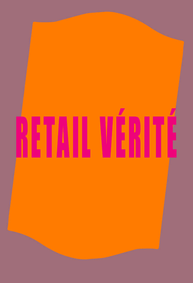
Cover of Retail Vérité

San Serriffe

Retail Vérité

A Maior

Fiction €14.00

Once upon a time there was a shopping center just off Dam Square, a stone’s throw from the Madame Tussauds, not far from Primark, two streets across De Bijenkorf overshadowing the Magna Plaza, and just a couple doors down the Royal Palace in the middle of Amsterdam. It was the place where drag queen Tuu Lipa performed and Yeung sold eau de car engine oil. It was also where Mr. R looked for his human lover, where Inez became a millionaire, and where Yahoo launched its metaverse. “Welcome to the YAniverse,” greeted the Yahoo assistant…

Retail Vérité is the outcome of writing workshops organized by A Maior at San Serriffe. Through a blend of improvisation, larping and speed dating, the participants sketched characters and dialogues on-site.
This cohort featured Anouk Asselineau, Alva Bücking, Katherina Gorodynska, Chieri Higa, SeungJi Jo, Simon Marsiglia, Christina Ntanovasili, Young Eun Park, Ignacy Radtke, Matthew Senkowycz, Maja Simisic, Mehmet Süzgün, Simone Wegman, Bruno Zhu and others.

A Maior is a clothing and home goods store located in the outskirts of Viseu, Portugal. Since 2016, an eponymous exhibition program has taken place within the shopping environment. A Maior is managed by the staff, the artist Bruno Zhu and his family. A Maior has been featured in exhibitions at Melly, Rotterdam; Frans Hals Museum, Haarlem; Kunsthalle Freeport, Porto; X Museum, Beijing; Life Sport and BQ, both Berlin. In 2022, A Maior was the writer-in-residence at San Serriffe in Amsterdam, who commissioned Retail Verité, A Maior’s first novella.

With A Maior, Anouk Asselineau, Alva Bücking, Katherina Gorodynska, Chieri Higa, SeungJi Jo, Simon Marsiglia, Christina Ntanovasili, Young Eun Park, Ignacy Radtke, Matthew Senkowycz, Maja Simisic, Mehmet Süzgün, Simone Wegman, Bruno Zhu.
Designed by Elisabeth Klement

Cover of Devenir minéral | L’éditeur du dimanche

Avarie Publishing

Devenir minéral | L’éditeur du dimanche

Giuliana Prucca

Essays €38.00

Echoing Jean Dubuffet's idea that thought must arise from material in artistic practice, Giuliana Prucca, through this essay, reinterprets a moment in the history of 20th-century art using materials such as stone, sand, earth, and dust. She employs the mineral to illustrate that the creative act would be a trace of the body's disappearance. The loss of humanity and the deconstruction of the subject objectify themselves in the image. In other words, art resides in the tension between representation and its loss, ultimately leaving nothing but an image.

Drawing from the influential figure of Antonin Artaud, she weaves critical and poetic connections between the texts and works of various artists, writers, and thinkers, ranging from Jean Dubuffet to Jan Fabre and Anselm Kiefer, Yves Klein and Gutaï, Joë Bousquet to Camille Bryen and Francis Ponge, Gaston Bachelard to Gilles Deleuze, and Georges Bataille to Aby Warburg.

The material is not merely a thematic pretext; it is an active and explosive catapult that questions the arbitrary linearity of a conventionally assimilated art history. Following Ponge's example, Prucca applies the principles of poetry to criticism, starting from Artaud's material, the most undisciplined of poet-artist-thinkers of the modern era. This results in a critically inventive approach dangerously suited to its object, celebrating an anti-critique. The chosen writing materials, stonepaper for the cover and recycled paper for the pages, is consistent, intending to give the impression of being covered in dust.

The essay disrupts traditional reading habits and shatters the conservatism of art criticism by inhabiting writing space differently, presenting a physically engaging interaction. This is an essay in the literal sense, an experience where form never contradicts content, urging readers to take the risk of thinking deeply and embracing a new rhythm. A complex and challenging design invites them to choose different reading options, ultimately treating criticism as one would poetry.

Giuliana Prucca [Paris | Berlin] is an independent curator, researcher, and writer. She is the founder and art director of the publishing house AVARIE, specialising in contemporary art books that explore the relationships between text and image, body and space.

Graphic design, art direction by Vito Raimondi

Cover of ’Est Pas Une

Onomatopee

’Est Pas Une

Philip Poppek

By way of archiving, digital translation and reproduction, Philip Poppek extracts from Magritte’s word paintings twenty-six letters; segmental symbols of a textual system form an alphabet of a, with a familiar apple punctuating a provisional end to the sequence. A poetic correspondence with the letter a speculates on the prehistory of this alphabet, as though searching for some indication as to how we may have come to where we are now, in this ‘post-factual moment’.

Maybe at some point we fell into the foxes’ den, only to re-surface in a landscape of ruins. This book poses a number of necessary questions, perhaps beginning with: ‘Which feminine noun trails after the title script ‘est pas une?

Pomme? Pipe? Histoire? Communauté?

Cover of Radical Media Archive Vol 01

Permanent Files

Radical Media Archive Vol 01

Ramdane Touhami, Émile Shahidi

Do you remember the last time you were looking forward to the future? We're not talking about flying cars or floating screens. We're talking about a credible vision of a better time to come. So when was the last time? How did it look? How did it feel?

Have a glance at page 223, about two-thirds in. This is a portrait of Frantz Fanon by Milton Glaser. One of the biggest names in commercial graphic design of the 20th century, painting the likeness of the giant of anti-colonial thought. Let’s leave aside the question of "who's the Milton Glaser of today?" for now, but if there was one, whose portrait would they be painting?

What we’re attempting, in these few hundred pages, is to track our favorite examples of the visual language of revolt and solidarity in the 1960s and 1970s, put them in dialogue with our most beloved works of graphic design of those decades, and celebrate the heroes who made them. 
Creative currents flowing from Paris to Tokyo, Cuba to Milano, Beirut to New York, Berkeley to London, with innovations and revolutions (both political and artistic) happening every year. Causes supported by incredible talent and inspiring design that activated people, uplifted liberation movements, advanced the struggles for social justice, and created bonds of global solidarity.

Sadly this cross-pollination between commercial art and the political ended around the late 1980s and those two worlds are now completely isolated from one another.
Why do movements not produce beautiful and memorable visuals anymore? Why do the biggest image makers of today not lend their talents to the good fights that need their help? We hope that these will intersect again, and the first step is to study their history.Friends, we are here to tell you that fighting for a better world is, in fact, not only extremely cool, but the coolest thing you can do — and we have the images to prove it!

Ramdane Touhami and Émile Shahidi have spent years researching and traveling to assemble a huge collection of books, rare periodicals and radical art that will soon be available for consultation in person and online, and of which this little book is just a taste.

Cover of Issue 9: John Akomfrah

Plaster Magazine

Issue 9: John Akomfrah

John Akomfrah

Periodicals €54.00

This special, limited-edition issue of Plaster celebrates Akomfrah’s commission for the British Pavilion at the 60th International Art Exhibition, La Biennale di Venezia. The linen presentation box contains: an essay by Akomfrah’s long-time friend and collaborator, the BAFTA-winning film curator June Givanni; an interview with Akomfrah by Harriet Lloyd-Smith; original portraits by photographer Siam Coy and a fold-out poster featuring an exclusive still from Akomfrah’s film installation, Listening All Night To The Rain, now screening in the British Pavilion at the Venice Biennale.

With creative direction by Constantine // Spence and design by Emma Ralph.

Cover of #GIVEPOETRYATRY

Verlag der Buchhandlung Walther König

#GIVEPOETRYATRY

Karl Holmqvist

Poetry €35.00

The artist’s book ‘#GIVEPOETRYATRYCOLLECTEDPOETRY1990-2020…’ features thirty years of Karl Holmqvist’s artist’s writing in the form of spoken word and concrete poetry, together with signature “cover versions” of lyrics from singer-songwriters such as Robyn and Taylor Swift. The book’s tightly written A4 format pages and cardboard-box-brown no-nonsense cover has been designed in a collaborative effort between the artist and designer Dan Solbach.

‘#GIVEPOETRYATRYCOLLECTEDPOETRY1990-2020…’ Karl Holmqvist’s artist’s book of collected poetry is published by Verlag der Buchhandlung Walther und Franz König on the occasion of projects at the Fridericianum, Kassel and gta exhibitions, ETH Zurich.