rile*books

Search books

Search books by title, author, publisher, keywords...

Cover of Media Burn—Ant Farm and the Making of an Image

Inventory Press

Media Burn—Ant Farm and the Making of an Image

Steve Seid

€35.00

Ant Farm, the conceptual architectural practice turned art collaborative, is known for such distinctive works as House of the Century (1971–73), Cadillac Ranch (1974), and The Eternal Frame (1975).

Of equal notoriety is Media Burn, Ant Farm’s legendary 1975 performance, in which a radically customized Cadillac was driven through a wall of burning television sets. Media Burn: Ant Farm and the Making of an Image is a vibrant assessment of the complex set of cultural references and art-making strategies informing this collision of twentieth-century icons.

Author Steve Seid (Berkeley Art Museum and Pacific Film Archive) probes the little-known critical backstory of this bold performance (and resulting video work) and its irreverent effort to mount a subversive critique of media hegemony while reimagining the core meaning of performance itself.

Media Burn: Ant Farm and the Making of an Image examines car culture, image proliferation, and radical architectural practice, and offers a close read of Media Burn’s numerous texts, speeches, ephemera, and artifacts.

128 pages ┊ Language: English

recommendations

Cover of Cyberfeminism Index

Inventory Press

Cyberfeminism Index

Mindy Seu

Hackers, scholars, artists and activists of all regions, races and sexual orientations consider how humans might reconstruct themselves by way of technology.

When learning about internet history, we are taught to focus on engineering, the military-industrial complex and the grandfathers who created the architecture and protocol, but the internet is not only a network of cables, servers and computers. It is an environment that shapes and is shaped by its inhabitants and their use.

The creation and use of the Cyberfeminism Index is a social and political act. It takes the name cyberfeminism as an umbrella, complicates it and pushes it into plain sight. Edited by designer, professor and researcher Mindy Seu (who began the project during a fellowship at the Harvard Law School's Berkman Klein Center for the Internet & Society, later presenting it at the New Museum), it includes more than 1,000 short entries of radical techno-critical activism in a variety of media, including excerpts from academic articles and scholarly texts; descriptions of hackerspaces, digital rights activist groups, bio-hacktivism; and depictions of feminist net art and new media art.

Contributors include: Skawennati, Charlotte Web, Melanie Hoff, Constanza Pina, Melissa Aguilar, Cornelia Sollfrank, Paola Ricaurte Quijano, Mary Maggic, Neema Githere, Helen Hester, Annie Goh, VNS Matrix, Klau Chinche / Klau Kinky and Irina Aristarkhova.

Cover of A New Program for Graphic Design

Inventory Press

A New Program for Graphic Design

David Reinfurt

A New Program for Graphic Design is the first communication-design textbook expressly of and for the 21st century. Three courses—Typography, Gestalt and Interface—provide the foundation of this book.

Through a series of in-depth historical case studies (from Benjamin Franklin to the Macintosh computer) and assignments that progressively build in complexity, A New Program for Graphic Design serves as a practical guide both for designers and for undergraduate students coming from a range of other disciplines.

Synthesizing the pragmatic with the experimental, and drawing on the work of Max Bill, Beatrice Warde, Muriel Cooper and Stewart Brand (among many others), it builds upon mid-to-late 20th-century pedagogical models to convey contemporary design principles in an understandable form for students of all levels—treating graphic design as a liberal art that informs the dissemination of knowledge across all disciplines. For those seeking to understand and shape our increasingly networked world of information, this guide to visual literacy is an indispensable tool.

David Reinfurt (born 1971), a graphic designer, writer and educator, reestablished the Typography Studio at Princeton University and introduced the study of graphic design. Previously, he held positions at Columbia University Graduate School of Architecture, Planning and Preservation, Rhode Island School of Design and Yale University School of Art. As a cofounder of O-R-G inc. (2000), Dexter Sinister (2006) and the Serving Library (2012), Reinfurt has been involved in several studios that have reimagined graphic design, publishing and archiving in the 21st century. He was the lead designer for the New York City MTA Metrocard vending machine interface, still in use today. His work is included in the collections of the Walker Art Center, Whitney Museum of American Art, Cooper Hewitt National Design Museum and the Museum of Modern Art. He is the co-author of Muriel Cooper (MIT Press, 2017), a book about the pioneering designer.

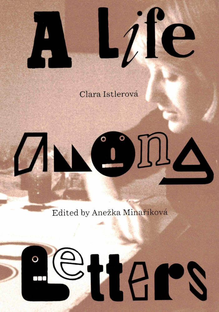
Cover of Clara Istlerová: a Life Among Letters

Inventory Press

Clara Istlerová: a Life Among Letters

Anežka Minaříková, Clara Istlerová

Clara Istlerová: A Life Among Letters is the first publication in the United States to delve into the design landscape of the former Czechoslovakia through the lens of Czech designer Clara Istlerová (born 1944). A trailblazer in her field, Istlerová was one of the few women in the male-dominated field of Czech typography. This publication introduces readers to Istlerová’s renowned book designs, particularly highlighting the analog processes she utilized to create one of the most influential books on Czech architecture, Švácha, Rostislav. From Modernity to Functionalism (Odeon, 1985).

The publication features an intimate interview with Istlerová conducted by editor Anežka Minaříková, accompanied by work from Istlerová’s personal archive alongside discussions detailing her creative process. Offering a vivid portrayal of an era where design was a tangible, labor-intensive endeavor carried out in close collaboration with typesetters and printers, the publication unveils the Czech design narrative of the twentieth century to English-speaking readers, highlighting Istlerová’s lasting impact and central role.

Design by Anežka Minaříková and Marek Nedelka

Cover of A Queer Year of Love Letters

Inventory Press

A Queer Year of Love Letters

Nat Pyper

A Queer Year of Love Letters: Alphabets Against Erasure is a toolkit for writing and remembering queer and trans histories. Expanding on Nat Pyper’s series of fonts whose letterforms derive from the life stories and printed traces of countercultural queers of the last several decades, this new book showcases overlooked biographies alongside previously unseen archival materials, as well as Pyper’s unique approach to designing fonts as containers for memory.

The book debuts a new essay by Pyper, and includes contributions from Paul Soulellis, Claire Star Finch, Silas Munro, Lukaza Branfman-Verissimo, Rosen Eveleigh, and G. B. Jones that offer vital perspectives on queer archival practices, language lineages, design as protest, and love as the basis for research. Part reader, part type specimen, part love letter, these fonts foreground the politics of queer memory while opening up new avenues for writers, designers, and curious readers.

Dear writer,
A Queer Year of Love Letters is a series of fonts that remembers the lives and work of countercultural queers of the past several decades. The series aims to make the act of remembering these overlooked and illegitimate histories accessible to other people, as easy as typing. Better yet: it aims to make the act of typing an act of remembering. That these fonts might be considered typefaces is incidental. They are an attempt to improvise a clandestine lineage, an aspatial and atemporal kind of queer kinship, through the act of writing.
I began making these fonts in order to rapidly document and disseminate the work and ideas that they cite. I pack these histories, or part of them, into fonts for a couple of reasons. First, font files are durable. OpenType fonts (.OTFs) have persisted in their ubiquity since the late '90s and maintain their utility as a nimble and reliable format. Second, fonts have the capacity to contain a hefty amount of information within a tiny package. In under 100 kilobytes, an entire alphabet! In the font’s metadata, a manifesto! Fonts then function as a useful format for ferrying information from one place to another.
I am using these fonts as time machines. These machines take me back—to Robert Ford and Black gay and lesbian underground publishing in early 1990s Chicago; to the Lesbian Alliance, a socialist-feminist enclave in 1970s St. Louis, Missouri; to G.B. Jones and queer punk filmmaking in 1980s downtown Toronto—but they also take me forward to unknown futures through the act of writing itself. In use, these fonts engage the past as a provocation. They engage the past as a verb.

Is this romantic? Yes.

Love,
Nat

Cover of O Fortuna

Flat i

O Fortuna

Jacob Dwyer

Fiction €10.00

In 2015, Jacob finds himself wandering the streets, swamps and cemeteries of New Orleans. Through his search for a man named Ignatius, 'O Fortuna' tells the story of his attempt to make a film. We discover the city’s unique atmosphere and meet a bizarre cast of characters who assist Jacob with his uncertain attempts at shooting scenes of DAT LIKWID LAND.

Cover of The Book of Na

Wendy's Subway

The Book of Na

Na Mira

Fiction €28.00

In The Book of Na, translation acts at the edge of perception. Tracing across projects in film, video, and performance, Na Mira reflects on the violent fragmentation of bodies while refusing the containment of geographic and corporeal borders. In 1977, a name is cut at an immigration office. This gap turns into an intergenerational score for becoming heat, hexagram, hologram. Using oracular and glitching technologies, Mira witnesses what escapes data: doppelgängers, dreams, endangered tigers, tesseracts, A. Turiyasangitananda Coltrane's stairs, Theresa Hak Kyung Cha in a theater, Korean shamanism, frozen ligaments, wildfires, borderlands, subatomic particles, and pink. Syncing to a clock with neither face nor hands, Mira’s hauntological permutations in time, death, and relation travel outside the symbolic order and draw energy from the void.

Na Mira’s autobody rites have been presented at sites including Seoul Museum of Art; Museum of Contemporary Art, Los Angeles; Portland Institute of Contemporary Art; Participant Inc., New York; and Whitney Museum of American Art, New York. She earned an MFA from the University of California, Los Angeles. She grew up between the US and East Asia and teaches outside.

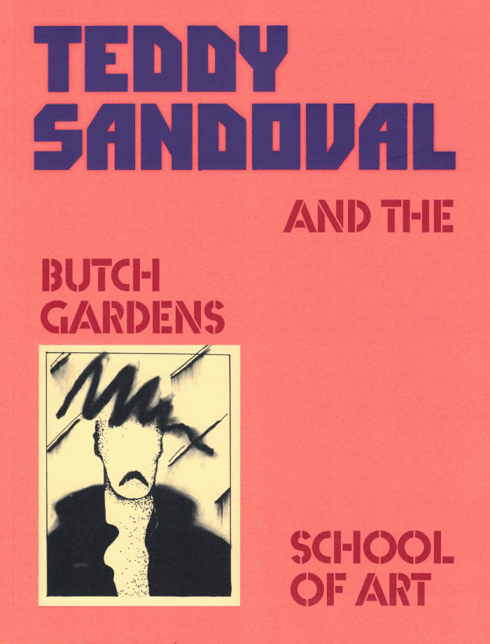
Cover of Teddy Sandoval and the Butch Gardens School of Art

Inventory Press

Teddy Sandoval and the Butch Gardens School of Art

C. Ondine Chavoya, David Evans Frantz

Published to accompany the artist’s first retrospective exhibition, Teddy Sandoval and the Butch Gardens School of Art examines the work of the inventive yet overlooked Teddy Sandoval, a central figure in Los Angeles’s queer and Chicanx artistic circles. Sandoval was known for producing subversive and playful artworks in a range of media that explored the codes of gender and sexuality, particularly conceptions of masculinity.

This publication surveys Sandoval’s work alongside other queer, Latinx, and Latin American artists whose practices profoundly resonate. This expansive catalogue features essays by C. Ondine Chavoya, David Evans Frantz, Raquel Gutiérrez, and Mari Rodríguez Binnie, as well as biographical entries on other artists featured in the exhibition, including Félix Ángel, Myrna Báez, Álvaro Barrios, Ester Hernández, Hudinilson Jr., Antonio Lopez, María Martínez-Cañas, Marisol, and Joey Terrill.

Design by Content Object
Co-published by Inventory Press, Williams College Museum of Art, Vincent Price Art Museum, and Independent Curators International

Cover of It goes like this

Self-Published

It goes like this

Damien Troadec

It goes like this: lower and lower and lower and... Bring down all these towers! You're sinking into this. I'm alone and we don't care. Am I just passing time?