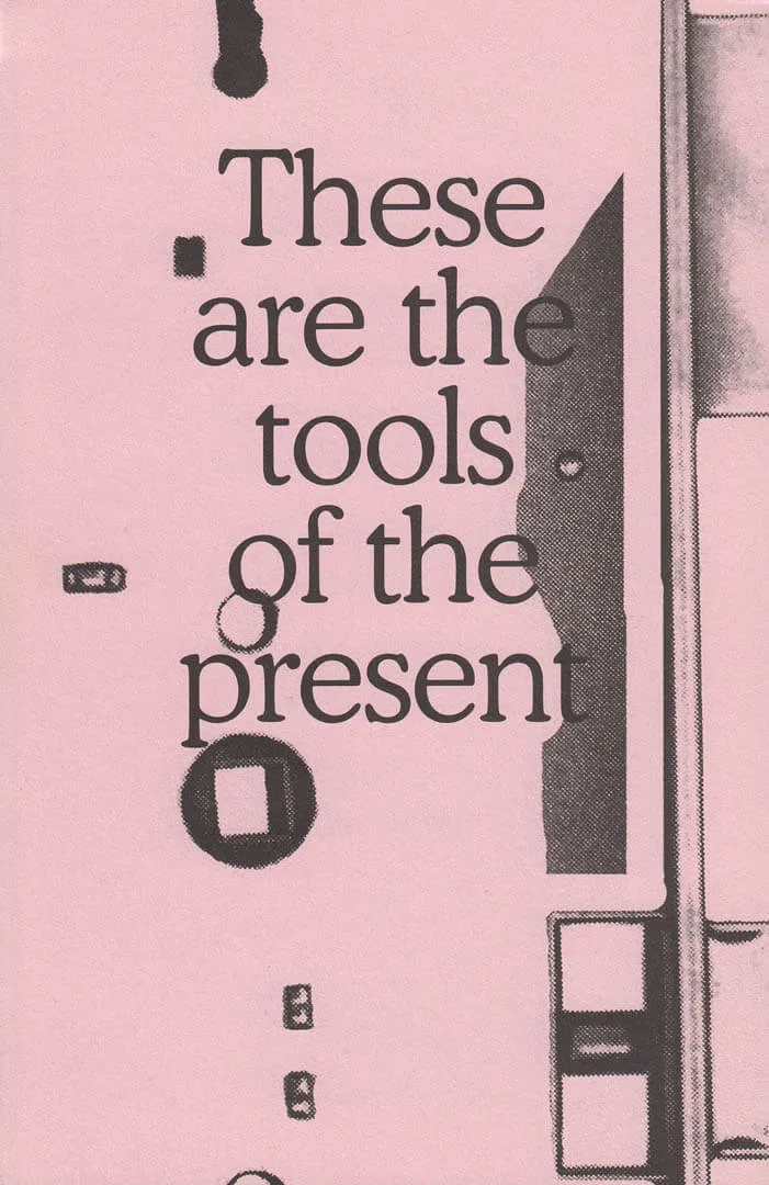
rile*books

Search books

Search books by title, author, publisher, keywords...

Cover of bruit

Gevaert Editions

bruit

Hugo Bonamin

€58.00

Hardcover, offset printing, 508 p., 31.8 x 25 cm.  Printed by Cultura, Gent
Edition of 265 copies. A deluxe edition, accompanied by an original work numbered n/508  (oil pastel on paper A3), has been produced in 35 copies signed and numbered by the artist .

Language: English

recommendations

Cover of Tout geste est renversement – Every gesture is reversal

Gevaert Editions

Tout geste est renversement – Every gesture is reversal

Chloe Chignell, Laurianne Bixhain

Tout geste est renversement – Every gesture is reversal is a publication by artist Laurianne Bixhain comprising an imahe captured and silkscreen printed by Bixhain and a text written by Chloe Chignell. The work addresses the potential for mutual transformation between language and materials, whether human or non human. How does language traverse the body? What are its resonances? How does it shape physical presence, gestures or thoughts? 

A2 silkscreen printed poster
Designed by Morgane Le Ferec.
Printed in 300 Copies. 

Cover of Wind & De wilgen - Wind & The Willows

Gevaert Editions

Wind & De wilgen - Wind & The Willows

Lawrence Weiner

Wind & De Wilgen (English/Dutch) was designed by Lawrence Weiner and published on the occasion of the execution of his work Wind & The Willows in the Openluchtmuseum voor beeldhouwkunst Middelheim, Antwerp.

Lawrence Weiner was an American artist and one of the central figures in the formation of conceptual art in de 60s. His work was strongly language-based and often took form in typographic texts, also visible in this artist book. 

Edition of 1000 copies

Cover of the she

Gevaert Editions

the she

Asger Taiaksev, Sylvie Eyberg

‘the she’ compares texts by Virginia Woolf with their French translation, reproducing parts of the novelles ‘The String Quartet' & ‘Blue and Green’ and the novel ‘The Years’. Of the novellas, she kept only the articles the in English and le, la, les in French, exactly as they appear in the editions. Of the novel, only the pronouns she in English and elle in French remain.

The publication includes identical two booklets, one bound and one unbound, both uncut, referring to old books which were often sold bound but uncut.

Offset printing. Printed by Cultura, Wetteren

Edition of 123 numbered copies

Cover of Pictograms

Nieves

Pictograms

Warja Honegger-Lavater

A previously unpublished collection of 60 ink pictograms, drawn between 1976 and 1996, originally printed individually as A2 plane prints.

An early progenitor of the artist's book genre, Warja Honegger-Lavater was born in Winterthur, Switzerland in 1913. She worked as an illustrator for the magazine Jeunesse from 1944-1958, and moved to New York shortly thereafter where she began a wonderful series of artist's books. 
These books were published between 1962 and 1971, an exceptionally ripe time for artists to turn to the bookform, a time when the most often cited "first" artist's book also appeared, Twentysix Gasoline Stations (1962) by Ed Ruscha.

All of Honegger-Lavater's books are made using the accordion-fold binding. Her aesthetic has been aptly described as "very clean, very Swiss." Each book tells a story, sequentially, like traditional books, but varying from them by rarely using words. Instead she chooses a symbol to represent, for example, a character, as in the red dot standing in for Red Riding Hood in Little Red Riding Hood.

Cover of sawing a plank is like going for a walk

Posture Editions

sawing a plank is like going for a walk

Kato Six

With texts by Phillip Van den Bossche, Filarowska and a conversation between Eva Wittocx and the artist (NL/EN)


Nº 48 / October 2022

sawing a plank is like going for a walk by Kato Six (b. 1986) is published on the occasion of Kato’s solo exhibition at M Leuven this autumn. This book encapsulates 10 years of her quest as an artist.


The work of Kato Six (b. 1986) balances between abstract and figurative art. She works on different themes which she develops into series or ensembles. Architecture, design, domesticity and utensils all act as important references. Starting there, she uses recognisable and everyday materials such as MDF, stone, plastic or textiles.
Kato wants to question certain affinities and let the viewer look at familiar objects or images from a different perspective. As a viewer, you feel connected to the object or image but the actual meaning or function no longer applies.

Some of my works refer to the domestic, especially the most recent ones, such as ‘Carpet Beater Carpet’ and ‘Striped Knitwear’. The invisible work done by “housewives”, but also by workers or maintenance staff, is certainly one of the themes addressed in ‘Carpet Beater Carpet’. The above works are textile works, created with so-called “soft skills”. In the arts, these “soft skills” are often attributed to female artists — women often being assigned a certain medium.
Kato Six in conversation with Eva Wittocx in “sawing a plank is like going for a walk”

Cover of Birthday

Zolo Press

Birthday

Bridget Mullen

Bridget Mullen is the ruler of an unruly roost. Between 2021 and 2023, she gave birth to forty-seven paintings, each twelve-by-nine inches: kin ugly and cute, monstrous, fleshy, repulsive, droopy-eyed, and sneering as they cross the universal threshold into the no less frightening world that awaits. Birthday reunites Mullen's uncanny litter alongside a conversation between the artist and Lucas Blalock.

The paintings in New York-based artist Bridget Mullen's Birthday series utilize two distinct parameters to guide the creation of the iterative works: a vertical orientation at an intimate scale of 12 x 9 inches and a visualization of perhaps the ultimate creative act—the moment of birth. Through this consistent scale and thematic hyper focus, the artist employs endless formal variations in composition, color, and paint application. The result is a series of paintings that share a common structure yet champion individuality.

Contrasting colors provoke a visible tension, one that is at times compressed and, in other moments, elastic. Suddenly, abstract shapes come into focus as human anatomies, capable of expressing emotion. Undulating lines of various thicknesses and layered colors squeeze together, revealing peculiar faces and gestures that emerge from a central point. The repetition of thin lines creates a visual stutter of pigment, alluding to the passage of time or rapid movement.
The works in Birthday build on Mullen's practice, combining color, decisive mark-making, intuition, and experimentation to conjure psychedelic configurations. Sculptural dimensionality and flatness, representation and abstraction, and solidity and fluidity, serve not as dichotomies within these works, but as two complementary halves of a whole. Together, the forms and figures of the Birthday series are imbued with a sense of life, pregnant with agency and potential.

Cover of Catalog Issue 21 — 'Impressed'

Cataloging

Catalog Issue 21 — 'Impressed'

Lieven Lahaye

Catalog is a serial publication about cataloging written by Lieven Lahaye and designed by Ott Metusala. This is Catalog issue 21, ‘Impressed’, it’s part of a sub-series on near invisibility. Published on the occasion of the exhibition ‘Dear Friend’ at EKA Gallery, Tallinn in September 2022. This issue of Catalog was produced during a residency period at Air Berlin Alexanderplatz, May-August 2022.

Cover of This Is Not a Memoir

Montez Press

This Is Not a Memoir

Janette Parris

What do you call a memoir that isn’t? In This Is Not a Memoir, Janette Parris incisively narrates a journey through lost high street landmarks of East and South London in a series of detailed artworks blending map, archive and anecdote with deadpan humour. Part graphic novel, part recollection, and accompanied by an in-conversation between Janette Parris and Gilane Tawadros, this is an intimate exploration of what it means to have ownership of public space, from Wimpy to Woolworth’s via Canning Town. And somewhere in the gaps, in absent moments caught gazing at the sky or a kerbside, an impression of a life emerges–or is that just what she wants you to think?

“This book by Janette Parris tells a deflationary yet expressive coming-of-age story in the East End of London. While it may seem fun and superficial, its considerable power lies in how it moves through memories and moments in a witty and light-footed way presented as a roman-à-clef. This Is Not a Memoir is particular in the way it conjures a world of the 1970s and 1980s that is lost to most of London, yet still resonates with what it means to grow up as a working class young woman who ends up at art school and becomes an artist. It is a brave book to make, but one that will be remembered.”
Rachel Garfield, artist, Professor of Fine Art at the Royal College of Art and author of Experimental Filmmaking and Punk: Feminist Audio Visual Culture in the 1970s and 1980s (2021)

Janette Parris is an artist who investigates the contemporary urban experience, using narrative, humour and popular formats including soap opera, stand-up comedy, musical theatre, pop mu-sic, cartoons, comics and animation. Parris has exhibited widely nationally and internationally for 25 years at spaces including TATE, The New Art Gallery Walsall, ICA, Kunsthaus Zürich, Hay-ward Gallery Touring, Art on the Underground and Royal Academy of Arts.