rile*books

Search books

Search books by title, author, publisher, keywords...

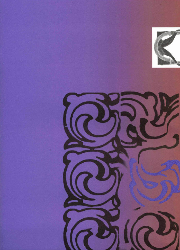
Cover of Ornamental Portal

The Palace of Typographic Masonry

Ornamental Portal

Rietlanden Women’s Office

€16.00

The Palace of Typographic Masonry is an (imaginary) institute for the splendour and variety of visual languages. The Ornamental Portal informs the ornamental attitude of Rietlanden Women’s Office, the collective that designed this folding sheet for Von Wersin’s Kitchen. On the backside ‘The Redemptive Qualities Of Ornament’, a text by Dirk Vis, is printed. This iris printed sheet is send in a specific envelope depicting and describing the updated collection of Von Wersin's Kitchen.

recommendations

Cover of Solidaires!!!

La Mousse Éditions

Solidaires!!!

Anaïs Enjalbert

Labor €20.00

Solidaires est un syndicat de lutte et de transformation sociale qui défend les travailleuses et travailleurs de France.

Cet ouvrage réunit une sélection de plus de 70 visuels créés par la graphiste Anaïs Enjalbert et des militant·e·s pour l'Union syndicale Solidaires.
Ce livre est une archive sélective de visuels dont les slogans accompagnent des valeurs et des pratiques émancipatrices allant du féminisme à l’antiracisme, de l’internationalisme à l’anti fascisme, de la lutte contre les lgbtphobies à celle contre le validisme. Ils soutiennent la lutte contre le capitalisme et pour les services publics.

Format 14 x 19,5 cm
Conception graphique: Magali Brueder

Cover of Typing...

Estonian Academy of Arts / EKA GD MA

Typing...

Lieven Lahaye

Essays €12.00

The fourth in a series of publications, featuring writing by graphic design students of EKA GD MA. Typing... includes essays, scripts, translations and stories on a wide range of topics: killing vowels and milling fonts, personal knowledge management, shortcuts, tedious/careful/tiring/joyful typesetting, type of Georgianness, typing in 3rab(izi) and typing in all lowercase.

With contributions by Anna Wittenkamp Rich, Archil Tsereteli, Fa(tima)-Ezzahra El Khammas, João (Juca) Pedro Nogueira, Karthik Palepu, Laura Martens, Linnea Lindgren, Rok Ifko Kranjc.

Designed by Fatima-Ezzahra El Khammas and Laura Martens
Cover by Hanafi Gazali

Cover of Image RIP: After Printing, Work & Planet Earth

Source Type

Image RIP: After Printing, Work & Planet Earth

Geoff Han

Image RIP, the first publication from Source Type, is centered around New York graphic designer Geoff Han’s investigation into the Shenzen-based printer Artron and explores subjects ranging from design, production, work, and the environment in the post-industrial economy. The book gathers essays by Danielle Aubert, David Bennewith, Geoff Han, Ming Lin, Shanzhai Lyric, David Reinfurt, Mindy Seu, and Dena Yago, and features images by Ann Woo. Image RIP reflects a consistent theme in Han’s practice of the manipulation of image reproduction, printing, production, code, and other techniques to affect the process of viewing and reading.

Cover of Makulatur – 2010-2016

Bom Dia Books

Makulatur – 2010-2016

Manuel Raeder

A collection of misprinted sheets originating from books designed by graphic designer Manuel Raeder: a “behind the scene” project, which documents the early stage of book production and its conventions.

Makulatur, a German word that derives from lat. maculatura “something stained”, refers to misprinted paper that is discarded at the beginning of the printing process as use- and worthless. In 2010, the graphic designer Manuel Raeder started to collect and preserve misprinted sheets of all the publications he designed not only for his own publishing house Bom Dia Boa Tarde Boa Noite but also for fellow artists and institutions.

This waste paper that shows all difficulties arising in the early stage of production—trails, testy or stains—he combined to a new volume as a compilation of maculae “stains”. Thus, he dissolved the spoiled material from the realm of invisibility and displays it to the public whereby he reveals and reflects on the conventions of a book.

Graphic designer Manuel Raeder lives and works in Berlin.

Cover of Font News

Self-Published

Font News

Erkin Karamemet

For the very first time, the newspaper Font News, published together with the supplement Font Menu, showcases the typographic work of Erkin Karamemet from his own label as printed matter. The large format of the newspaper invites the viewer to appreciate the typefaces in large, poster-like sizes. The curated texts by Gerrit Kotsivos reference pop-cultural curiosities and are further enhanced by overlaid spreads with amusing illustrations by the London-based artist Why Ebay. This limited issue, produced as a special artist edition of only 300 copies, is something for typography enthusiasts to collect, explore, and celebrate contemporary type design.