rile*books

Search books

Search books by title, author, publisher, keywords...

Cover of Catalog Issue 16 — 'Annotations'

Cataloging

Catalog Issue 16 — 'Annotations'

Lieven Lahaye

€5.00

Catalog is a serial publication about cataloging, written by Lieven Lahaye and designed by Ott Metusala. This is Catalog #16, ‘Annotations’, it’s a collection of sources, notes, annotations, traces, paths and earworms related to ongoing research.

Language: English

recommendations

Cover of Catalog issue 17 — ‘Introduction’

Cataloging

Catalog issue 17 — ‘Introduction’

Lieven Lahaye

Catalog is a serial publication about cataloging, written by Lieven Lahaye and designed by Ott Metusala. This is Catalog issue 17, ‘Introduction’, it’s part of a sub-series, researching the life, work and near invisibility of writer Duncan Smith (1954–1991).

Cover of Typing...

Estonian Academy of Arts / EKA GD MA

Typing...

Lieven Lahaye

The fourth in a series of publications, featuring writing by graphic design students of EKA GD MA. Typing... includes essays, scripts, translations and stories on a wide range of topics: killing vowels and milling fonts, personal knowledge management, shortcuts, tedious/careful/tiring/joyful typesetting, type of Georgianness, typing in 3rab(izi) and typing in all lowercase.

With contributions by Anna Wittenkamp Rich, Archil Tsereteli, Fa(tima)-Ezzahra El Khammas, João (Juca) Pedro Nogueira, Karthik Palepu, Laura Martens, Linnea Lindgren, Rok Ifko Kranjc.

Designed by Fatima-Ezzahra El Khammas and Laura Martens
Cover by Hanafi Gazali

Cover of Dear Friend Catalogue 2019-2022

Lugemik

Dear Friend Catalogue 2019-2022

Ott Kagovere, Sandra Nuut

Dear Friend is a monthly letter format publication covering design events, issues, and ideas. This publication distributed via snail mail is initiated by Sandra Nuut and Ott Kagovere.

The publication edited by Sandra Nuut & Ott Kagovere features all the letters from the Dear Friend publishing project, which they initiated at the Graphic Design Department of the Estonian Academy of Arts in 2018. The book includes contributions by Singapore-based design writer Justin Zhuang, designer and writer Else Lagerspetz, and artist Lieven Lahaye. The book is designed by Ott Kagovere and published by Lugemik and Estonian Academy of Arts.

Texts by Justin Zhuang, Lieven Lahaye, Else Lagerspetz

Letters written by Alicia Ajayi, Stuart Bertolotti-Bailey, Claudia Doms, Nell Donkers, Maarin Ektermann, Rosen Eveleigh, Maryam Fanni, Saara Hannus, Eik Hermann, Paul John, Maria Juur, Ott Kagovere, Maarja Kangro, Arja Karhumaa, Kristina Ketola Bore, Nicole Killian, Rachel Kinbar, Tuomas Kortteinen, Keiu Krikmann, Kadri Laas, Else Lagerspetz, Lieven Lahaye, James Langdon, Jungmyung Lee, Kai Lobjakas, Michelle Millar Fisher, Maria Muuk, Sheere Ng, Sandra Nuut, Laura Pappa, Jack Self, Indrek Sirkel, Paul Soulellis, Triin Tamm, Laura Toots, Alice Twemlow, Loore Viires, Sean Yendrys, Justin Zhuang

Cover of to flaunt, really

Estonian Academy of Arts / EKA GD MA

to flaunt, really

Lieven Lahaye

“… Ever since its inception as a profession, graphic design has exhibited its necessity to make information public. Its urge to expand and to reproduce reflects its capitalist inheritance. This desire however isn’t always shared by all stories molded and articulated by the discipline.

Publishing is preceded by a series of labours, but the act itself consists just of a very instant. It is one loud shriek from the top of a hill. A toppling-over. From then on a story will tumble downhill—distribute and disseminate. However that happens, and who it reaches is an unpredictable process. Thereafter publishing enables, and sets in motion, all its future readings and retellings.

Wondering the many contradictory sensibilities contained in this process, we attempt to grasp their whys, their hows and their ifs. The following essays— written by Sunny Lei, Haron Barashed, Agathe Mathel, Alina Scharnhorst, Villem Sarapuu, Gal Šnajder, Seppe-Hazel Laeremans, Fernanda Saval and Eva Claycomb—stretch and curl in between these various registers of opening up and closing in.

Unraveling the movements, strategies, forms and intentions of publishing, this book attempts to unfold their utterances, platforms, languidities, reinterpretations, identities, tactilities, ambiguities, characters and audiences.”

—from the introduction by Seppe-Hazel Laeremans and Agathe Mathel.

Cover of Ladies Wear the Blue

Self-Published

Ladies Wear the Blue

buren

Ladies wear the blue is a collection of watercolour drawings by the hand of Melissa Mabesoone and Oshin Albrecht. The blue watercolours portray women from different moments in time. The adjacent texts describe these women's existence, roles, desires or ideosyncrasies deriving from the 'blue' in their lives. From the first female police officers and Alices all around, to Courtney Love's blue baby dolls and the girl with the blue tattoo Olive Oatman, this publication is an ode to women venturing into the world, and a way to continue telling their herstories.

Cover of Visit [country]

sismógrafo

Visit [country]

Carlos Azeredo Mesquita

Performance €20.00

Visit [country] is an artist’s book that brings together texts taken word for word from official government tourism websites and state-produced promotional videos from every UN-recognized country in the world. Stripped of the usual accompanying imagery and inspirational music, what becomes clear is how tourism feeds on — and is fuelled by — nationalism, chauvinism, and the invention of identity.

Much like a “choose your own adventure” book, the reader is guided by a series of questions that connect one country to another through recurring ideas and clichés, and must decide whether to visit the destination with “the best food”, “the most beautiful women”, “the friendliest people”, or “the most authentic history”. The book also includes an extensive concept index that maps the thematic and linguistic patterns linking the nations’ self-descriptions. It is a journey where every country is the best.

The project grows out of The Complete National Anthems of the World, a durational performance first presented in 2023, and stands as a parallel, autonomous, yet complementary work.

Cover of BFTK — Issue 4: On Translation, Transmission & Transposition

Bricks from the Kiln

BFTK — Issue 4: On Translation, Transmission & Transposition

Andrew Walsh‐Lister, Matthew Stuart and 2 more

Bricks from the Kiln is an irregular journal edited by Andrew Lister and Matthew Stuart, sometimes with guest editors, that presents graphic design and typography as disciplines activated by and through other disciplines and lenses such as language, archives, collage, and more. It borrows its title from the glossary notes of Ret Marut’s "Der Ziegelbrenner," which was the ‘size, shape and colour of a brick’, and ran for 13 issues between 1917 and 1921.

The latest installment, "#4: On Translation, Transmission & Transposition," was published as an event (and now) a publication, with events at London College of Communication, Burley Fisher Books & Pig Rock bothy, Socttish National Gallery of Modern Art, and Inga (in November, 2019).
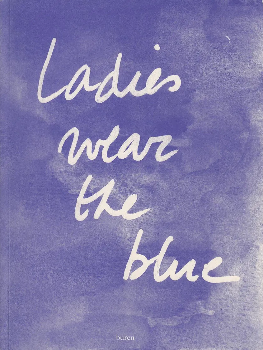
GREENING
Helen Marten
(front / back flaps)

JOY & HAPPINESS, FIDELITY
& INTIMACY IN TRANSLATION
Sophie Collins
(pp.4–13)

PLANETARY TRANSLATION
Don Mee Choi
(pp.15–19)

TRANSLATION AND A LIPOGRAM:
OR, ON FORMS OF AGAIN-WRITING
AND NO- (OR NOT THAT-) WRITING
Kate Briggs
(pp.23–33)

UNHOMING (1 of 4):
FOLLOWING HÖLDERLIN’S ‘HEIMAT’
Phil Baber
(pp.35–47)

SNOW WHITE AND THE WHITE
OF THE HUMAN EYEBALLS
Joyce Dixon
(pp.51–62)

ALTAMIRALTAMIRALTAMIRA
Florian Roithmayr
(pp.65–116)

LEVEL UP, LEVEL DOWN
Jen Calleja
(pp.119–124)

TRANS.MISSION [A.DIALOGUE]:
A JAVASCRIPT FOR THREE VOICES
J.R. Carpenter
(pp.127–134)

THE MECHANISATION OF ART
Edgar Wind
(glosses / annotations / insertions by
Natalie Ferris & Bryony Quinn)
(pp.137–144)

UNHOMING (2 of 4)
Phil Baber
(p.147)

COMMISSION FOR A NOIR MOVIE
B IN THE BAY OF BISCAY
Rebecca Collins
(pp.151–157)

UNHOMING (3 of 4)
Phil Baber
(pp.150–162)

EVERY CONTACT LEAVES A TRACE;
TRANSCRIBING OSTEON
Naomi Pearce
(pp.165–170)

HOW DOES A WORK END?
Karen Di Franco
(pp.173–193)

METONYMY Op.1 & Op.2
James Bulley
(pp.197–201)

AFRIKAN ALPHABETS EXTENDED
Saki Mafundikwa
(pp.204–207)

SUSAN HILLER: 1983
Natalie Ferris
(pp.209–217)

EVERY TELLING HAS A TALING /
EVERY STORY HAS AN ENDING
Matthew Stuart
(pp.220–233)

GRAPHIC PROPRIOCEPTION
James Langdon
(pp.235–254)

UNHOMING (4 of 4)
Phil Baber
(pp.257–263)

TUNNELLING AND AGGREGATING
FOR DESIGN RESEARCH
Bryony Quinn (text) &
Peter Nencini (images)
(pp.265–272)

LET IT PERCOLATE:
A MANIFESTO FOR READING
Sophie Seita
(pp.275–280)

288 pgs, 22.4 × 17 cm, Softcover, 2020

Cover of Klosterruinenzines

Bom Dia Books

Klosterruinenzines

Anna M. Szaflarski, Christopher Weickenmeier

Four zines, documenting and continuing a series of four exhibitions that took place last summer, also known as the summer of 2021 at Klosterruine Berlin. Digging up what’s always already left behind, this series reframes the exhibition as an excavation site and engages archeology as a speculative and aesthetic procedure. A map, a notebook, a calendar and a dream diary, these four zines allow you to become your own archeologist.

Texts: Simone Fattal, Bassem Saad, Anna M. Szaflarski, Christopher Weickenmeier
Designer: Studio Manuel Raeder