rile*books

Search books

Search books by title, author, publisher, keywords...

Cover of Unbound

Roma Publications

Unbound

Karel Martens

€39.00

‘Unbound’ accompanies Karel Martens’ first solo exhibition at the Stedelijk Museum Amsterdam, bringing together a wide-ranging body of work Martens made and collected over the entire span of his decades long career. Containing works from the show, collaged, overprinted, and juxtaposed with elements found around his studio, the book balances between being an artist book and a catalogue. This publication, thoughtfully designed by Jordi de Vetten and Susu Lee in close collaboration with Martens himself, functions as a handbook to his work. But it’s an unconventional one: unstructured, non-hierarchical, playful, personal, and associative.

Published in 2025 ┊ 216 pages ┊ Language: English

recommendations

Cover of 24 European Ethnographic Museums

Roma Publications

24 European Ethnographic Museums

Sara Sejin Chang

With the series '24 European Ethnographic Museums' Van der Heide questions the construction and identity of the ethnographic museum today. Here, the project becomes a collection of artefacts in and upon itself and by recording the names of these institutions Van der Heide places the viewer in front of the dilemma: who is authorized to decide what is an artefact, and what should be collected and for what reason? In the 19th century, with the birth of the current European nations, museums openly referred to their colonial past. Today the museums bare more euphemistic names like: ‘Museum der Kulturen’ or ‘World Museum’ but still place the West as the self-acclaimed center of the world.  The existence of the ethnographic museum, which is intertwined with the complicated and loaded colonial past, has been subject to contemporary criticism. While some of the European ethnographic institutions have attempted to come to terms with the past of their collections and their heritage, Van der Heide focuses upon how language continues to reflect the political present of the institutions.

Cover of Image RIP: After Printing, Work & Planet Earth

Source Type

Image RIP: After Printing, Work & Planet Earth

Geoff Han

Image RIP, the first publication from Source Type, is centered around New York graphic designer Geoff Han’s investigation into the Shenzen-based printer Artron and explores subjects ranging from design, production, work, and the environment in the post-industrial economy. The book gathers essays by Danielle Aubert, David Bennewith, Geoff Han, Ming Lin, Shanzhai Lyric, David Reinfurt, Mindy Seu, and Dena Yago, and features images by Ann Woo. Image RIP reflects a consistent theme in Han’s practice of the manipulation of image reproduction, printing, production, code, and other techniques to affect the process of viewing and reading.

Cover of Handwerk

Rollo Press

Handwerk

David Schatz, Philipp Herrmann and 1 more

Handwerk revives Berthold Wolpe’s early type design, originally called Wolpe Kursiv and cut in metal by Paul Koch in 1932. It first appeared in a 1936 craft symbol book featuring unique blackletter capitals. Due to persecution as a Jewish designer under the Nazi regime, Wolpe’s work faced delays and alterations and was finally released in 1952 in a modified form. Handwerk captures the original hand-lettered feel and includes stylistic sets that reference both the 1952 release and the original blackletter capitals, providing a historical perspective on Wolpe’s type design.

This Handwerk specimen is edited by Hammer (David Schatz & Sereina Rothenberger) with Philipp Herrmann and designed by Rietlanden Women’s Office. It accompanies the release of the same name font on www.outofthedark.swiss.

Cover of Archival Textures - Posting

Archival Textures

Archival Textures - Posting

Carolina Valente Pinto, Tabea Nixdorff

The book Posting brings together a selection of feminist posters from Dutch archives to reflect on posting as an activist strategy, holding the potential to create counter-publics to mainstream culture and to fight against the erasure, exoticization, or tokenism of bodies and experiences that deviate from normative preconceptions.

As is the case for many professions, in the history of Dutch graphic design the absence of women, non-binary, queer, Black designers is striking. This doesn’t only point back to systematic processes of exclusion in the first place, but also to the biases at play regarding whose work is remembered and archived. While efforts have been made to add forgotten names to the existing canon, the many posters, flyers and other printed matter shelved in queer and feminist archives remind us to question the notion of single authorship altogether and instead study graphic design as a decisively collaborative and transdisciplinary practice, which is especially true for community-led and volunteer-based projects.

The posters featured in this book point to this rich landscape of feminist organizing, and were found at the International Institute of Social History and the International Archive for the Women’s Movement (IAV-Atria) in Amsterdam.

Cover of A Queer Year of Love Letters

Inventory Press

A Queer Year of Love Letters

Nat Pyper

LGBTQI+ €25.00

A Queer Year of Love Letters: Alphabets Against Erasure is a toolkit for writing and remembering queer and trans histories. Expanding on Nat Pyper’s series of fonts whose letterforms derive from the life stories and printed traces of countercultural queers of the last several decades, this new book showcases overlooked biographies alongside previously unseen archival materials, as well as Pyper’s unique approach to designing fonts as containers for memory.

The book debuts a new essay by Pyper, and includes contributions from Paul Soulellis, Claire Star Finch, Silas Munro, Lukaza Branfman-Verissimo, Rosen Eveleigh, and G. B. Jones that offer vital perspectives on queer archival practices, language lineages, design as protest, and love as the basis for research. Part reader, part type specimen, part love letter, these fonts foreground the politics of queer memory while opening up new avenues for writers, designers, and curious readers.

Dear writer,
A Queer Year of Love Letters is a series of fonts that remembers the lives and work of countercultural queers of the past several decades. The series aims to make the act of remembering these overlooked and illegitimate histories accessible to other people, as easy as typing. Better yet: it aims to make the act of typing an act of remembering. That these fonts might be considered typefaces is incidental. They are an attempt to improvise a clandestine lineage, an aspatial and atemporal kind of queer kinship, through the act of writing.
I began making these fonts in order to rapidly document and disseminate the work and ideas that they cite. I pack these histories, or part of them, into fonts for a couple of reasons. First, font files are durable. OpenType fonts (.OTFs) have persisted in their ubiquity since the late '90s and maintain their utility as a nimble and reliable format. Second, fonts have the capacity to contain a hefty amount of information within a tiny package. In under 100 kilobytes, an entire alphabet! In the font’s metadata, a manifesto! Fonts then function as a useful format for ferrying information from one place to another.
I am using these fonts as time machines. These machines take me back—to Robert Ford and Black gay and lesbian underground publishing in early 1990s Chicago; to the Lesbian Alliance, a socialist-feminist enclave in 1970s St. Louis, Missouri; to G.B. Jones and queer punk filmmaking in 1980s downtown Toronto—but they also take me forward to unknown futures through the act of writing itself. In use, these fonts engage the past as a provocation. They engage the past as a verb.

Is this romantic? Yes.

Love,
Nat

Cover of Typing...

Estonian Academy of Arts / EKA GD MA

Typing...

Lieven Lahaye

Essays €12.00

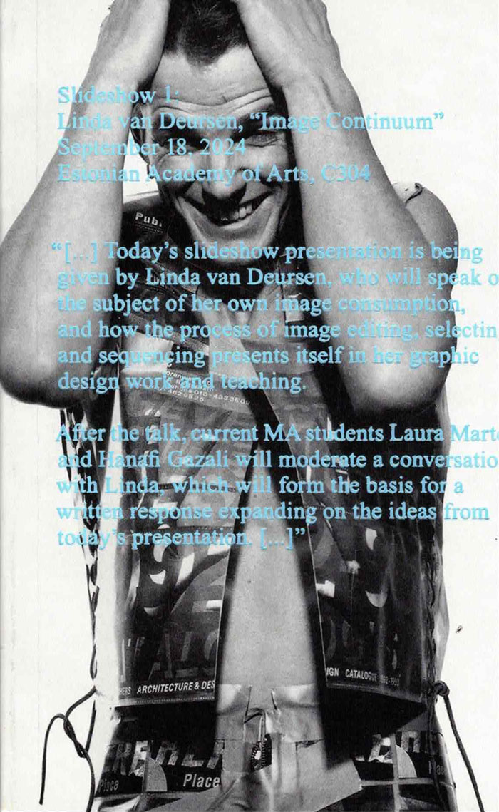
The fourth in a series of publications, featuring writing by graphic design students of EKA GD MA. Typing... includes essays, scripts, translations and stories on a wide range of topics: killing vowels and milling fonts, personal knowledge management, shortcuts, tedious/careful/tiring/joyful typesetting, type of Georgianness, typing in 3rab(izi) and typing in all lowercase.

With contributions by Anna Wittenkamp Rich, Archil Tsereteli, Fa(tima)-Ezzahra El Khammas, João (Juca) Pedro Nogueira, Karthik Palepu, Laura Martens, Linnea Lindgren, Rok Ifko Kranjc.

Designed by Fatima-Ezzahra El Khammas and Laura Martens
Cover by Hanafi Gazali