rile*books

Search books

Search books by title, author, publisher, keywords...

Cover of Natural Enemies Of Books: A Messy History Of Women In Printing And Typography

Occasional Papers

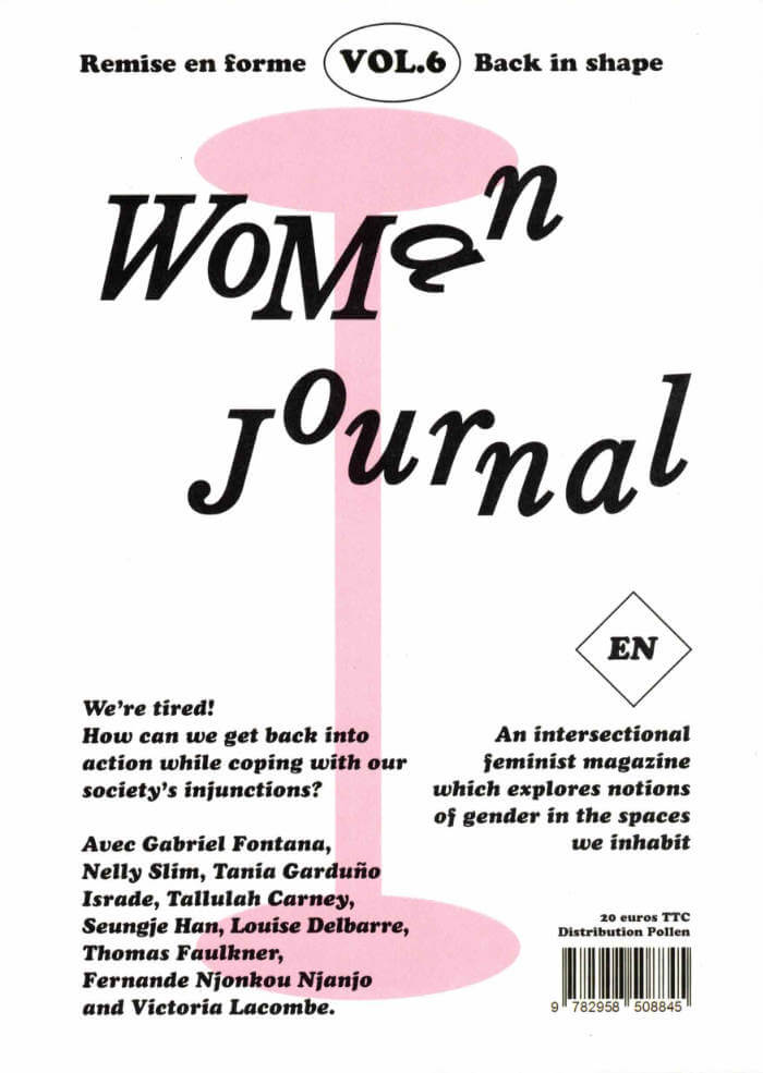
Natural Enemies Of Books: A Messy History Of Women In Printing And Typography

Sara Kaaman ed. , Maryam Fanni ed. , Matilda Flodmark ed.

€16.00

Natural Enemies of Books is a response to the groundbreaking 1937 publication 'Bookmaking on the Distaff Side', which brought together contributions by women printers, illustrators, authors, typographers, and typesetters, highlighting the print industry’s inequalities and proposing a takeover of the history of the book. Edited by feminist graphic design collective MMS, the publication includes newly commissioned essays and poems, conversations with former typesetters Inger Humlesjö, Ingegärd Waaranperä, Gail Cartmail, and Megan Downey, and reprints of the original book and other publications.

recommendations

Cover of Import – Export, Friperie

Occasional Papers

Import – Export, Friperie

Mekhitar Garabedian

This book brings together a selection of photographs by artist Mekhitar Garabedian, documenting the warehouse of his late father’s company, Melantex, which exported second-hand clothing from Belgium to the Middle East, Asia, and Africa. The images inspired a one-year sculptural intervention by Garabedian, commissioned by the Antwerp Public Art Collection.

Import—Export, Friperie tells a compelling personal and collective story of how displacement can be turned into economic livelihood while creating connections between old and new homes, languages, and textiles.

The photographs are accompanied by an in-depth conversation between Garabedian and curator Samuel Saelemakers about the relationship between photography and sculpture, public representation, and diasporic thinking.

Cover of One And Many Mirrors: Perspectives On Graphic Design Education

Occasional Papers

One And Many Mirrors: Perspectives On Graphic Design Education

Brad Haylock, Luke Wood

This ambitious book brings together a wide international selection of new and recent writing by educators and practitioners who question the rules and hierarchies of graphic design education today. It holds a vivid mirror up to the ways in which graphic design is imagined, taught, received, and reproduced. Edited by two designer-educators (Brad Haylock and Luke Wood), 'One and Many Mirrors' provides an urgent overview of the field of contemporary graphic design education for all those concerned with its past, present, and possible futures.

Cover of Girls Like Us #6 - Secrets

Girls Like Us

Girls Like Us #6 - Secrets

Jessica Geysel, Sara Kaaman and 2 more

A secret can be a private space for self-creation – or a shared site of pleasure.

We explore secrets in a plethora of forms and contexts. From layered accounts of mediaeval ecstasy to the unexplored sensory experience of smell. From camouflaged play to queer readings of astrological charts and the hidden history of house music. From a very analog point of view to the outskirts of the internet.

Cover of Handwerk

Rollo Press

Handwerk

David Schatz, Philipp Herrmann and 1 more

Handwerk revives Berthold Wolpe’s early type design, originally called Wolpe Kursiv and cut in metal by Paul Koch in 1932. It first appeared in a 1936 craft symbol book featuring unique blackletter capitals. Due to persecution as a Jewish designer under the Nazi regime, Wolpe’s work faced delays and alterations and was finally released in 1952 in a modified form. Handwerk captures the original hand-lettered feel and includes stylistic sets that reference both the 1952 release and the original blackletter capitals, providing a historical perspective on Wolpe’s type design.

This Handwerk specimen is edited by Hammer (David Schatz & Sereina Rothenberger) with Philipp Herrmann and designed by Rietlanden Women’s Office. It accompanies the release of the same name font on www.outofthedark.swiss.

Cover of Archival Textures - Posting

Archival Textures

Archival Textures - Posting

Carolina Valente Pinto, Tabea Nixdorff

The book Posting brings together a selection of feminist posters from Dutch archives to reflect on posting as an activist strategy, holding the potential to create counter-publics to mainstream culture and to fight against the erasure, exoticization, or tokenism of bodies and experiences that deviate from normative preconceptions.

As is the case for many professions, in the history of Dutch graphic design the absence of women, non-binary, queer, Black designers is striking. This doesn’t only point back to systematic processes of exclusion in the first place, but also to the biases at play regarding whose work is remembered and archived. While efforts have been made to add forgotten names to the existing canon, the many posters, flyers and other printed matter shelved in queer and feminist archives remind us to question the notion of single authorship altogether and instead study graphic design as a decisively collaborative and transdisciplinary practice, which is especially true for community-led and volunteer-based projects.

The posters featured in this book point to this rich landscape of feminist organizing, and were found at the International Institute of Social History and the International Archive for the Women’s Movement (IAV-Atria) in Amsterdam.

Cover of Makulatur – 2010-2016

Bom Dia Books

Makulatur – 2010-2016

Manuel Raeder

A collection of misprinted sheets originating from books designed by graphic designer Manuel Raeder: a “behind the scene” project, which documents the early stage of book production and its conventions.

Makulatur, a German word that derives from lat. maculatura “something stained”, refers to misprinted paper that is discarded at the beginning of the printing process as use- and worthless. In 2010, the graphic designer Manuel Raeder started to collect and preserve misprinted sheets of all the publications he designed not only for his own publishing house Bom Dia Boa Tarde Boa Noite but also for fellow artists and institutions.

This waste paper that shows all difficulties arising in the early stage of production—trails, testy or stains—he combined to a new volume as a compilation of maculae “stains”. Thus, he dissolved the spoiled material from the realm of invisibility and displays it to the public whereby he reveals and reflects on the conventions of a book.

Graphic designer Manuel Raeder lives and works in Berlin.

Cover of The Mollino Set

Rollo Press & Cabinet Books

The Mollino Set

Lytle Shaw

Photography €18.00

New York-based professor Lytle Shaw journeys to Italy in this adventurous exploration of the life and work of architect, designer, and photographer Carlo Mollino (1905–1973). In 1933 the young Mollino received a commission from Mussolini’s regime for his first building: an administrative centre in Piedmont. Later works include furniture and interior design, a book on photography, and an asymmetrical car that raced at Le Mans in 1955.

The book centres around Shaw’s realisation that this prolific talent’s conflicted legacy offers a unique window on the role that post-war Italian politics and culture played in the country’s reimagining of itself as a victim, rather than a proponent, of fascism.