rile*books

Search books

Search books by title, author, publisher, keywords...

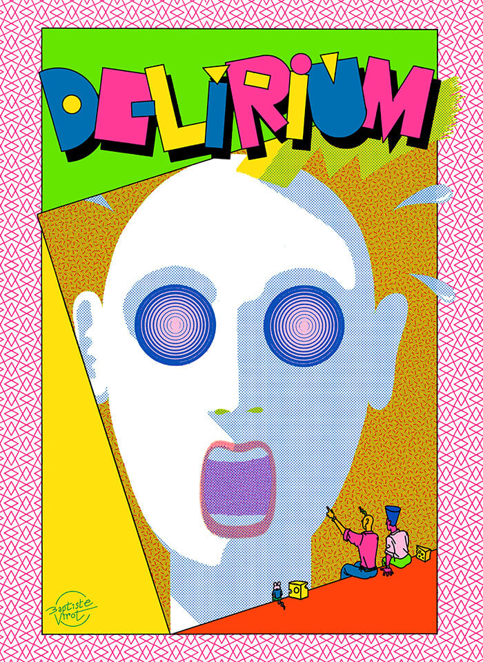
Cover of Delirium

Animal Press

Delirium

Baptiste Virot

€35.00

The humor in Delirium seems a cross between the classic comic strip gags of Ernie Bushmiller and the theatrical absurdity of Monty Python, with a dose of Jim Woodring’s colorful, acid-trip antics thrown in as well.

What makes these strips special is that they achieve things that can only be done in comics; Virot’s mastery of the medium’s fundamental mechanics (timing, composition, closure) is matched only by his unbounded imagination. But for all of its absurdity, Virot captures simple moments of undeniable humor and pure joy with simple punchlines and and unexpected twists.

This makes Delirium a unique and special work that excels on two levels: a formal experiment that pushes the visual language of comics to dazzling and frantic limits, as well as a deeply satisfying and laugh-out-loud compendium of surrealist set-ups and visual one-liners.

recommendations

Cover of One And Many Mirrors: Perspectives On Graphic Design Education

Occasional Papers

One And Many Mirrors: Perspectives On Graphic Design Education

Brad Haylock, Luke Wood

This ambitious book brings together a wide international selection of new and recent writing by educators and practitioners who question the rules and hierarchies of graphic design education today. It holds a vivid mirror up to the ways in which graphic design is imagined, taught, received, and reproduced. Edited by two designer-educators (Brad Haylock and Luke Wood), 'One and Many Mirrors' provides an urgent overview of the field of contemporary graphic design education for all those concerned with its past, present, and possible futures.

Cover of A New Program for Graphic Design

Inventory Press

A New Program for Graphic Design

David Reinfurt

A New Program for Graphic Design is the first communication-design textbook expressly of and for the 21st century. Three courses—Typography, Gestalt and Interface—provide the foundation of this book.

Through a series of in-depth historical case studies (from Benjamin Franklin to the Macintosh computer) and assignments that progressively build in complexity, A New Program for Graphic Design serves as a practical guide both for designers and for undergraduate students coming from a range of other disciplines.

Synthesizing the pragmatic with the experimental, and drawing on the work of Max Bill, Beatrice Warde, Muriel Cooper and Stewart Brand (among many others), it builds upon mid-to-late 20th-century pedagogical models to convey contemporary design principles in an understandable form for students of all levels—treating graphic design as a liberal art that informs the dissemination of knowledge across all disciplines. For those seeking to understand and shape our increasingly networked world of information, this guide to visual literacy is an indispensable tool.

David Reinfurt (born 1971), a graphic designer, writer and educator, reestablished the Typography Studio at Princeton University and introduced the study of graphic design. Previously, he held positions at Columbia University Graduate School of Architecture, Planning and Preservation, Rhode Island School of Design and Yale University School of Art. As a cofounder of O-R-G inc. (2000), Dexter Sinister (2006) and the Serving Library (2012), Reinfurt has been involved in several studios that have reimagined graphic design, publishing and archiving in the 21st century. He was the lead designer for the New York City MTA Metrocard vending machine interface, still in use today. His work is included in the collections of the Walker Art Center, Whitney Museum of American Art, Cooper Hewitt National Design Museum and the Museum of Modern Art. He is the co-author of Muriel Cooper (MIT Press, 2017), a book about the pioneering designer.

Cover of Handwerk

Rollo Press

Handwerk

David Schatz, Philipp Herrmann and 1 more

Handwerk revives Berthold Wolpe’s early type design, originally called Wolpe Kursiv and cut in metal by Paul Koch in 1932. It first appeared in a 1936 craft symbol book featuring unique blackletter capitals. Due to persecution as a Jewish designer under the Nazi regime, Wolpe’s work faced delays and alterations and was finally released in 1952 in a modified form. Handwerk captures the original hand-lettered feel and includes stylistic sets that reference both the 1952 release and the original blackletter capitals, providing a historical perspective on Wolpe’s type design.

This Handwerk specimen is edited by Hammer (David Schatz & Sereina Rothenberger) with Philipp Herrmann and designed by Rietlanden Women’s Office. It accompanies the release of the same name font on www.outofthedark.swiss.

Cover of Typing...

Estonian Academy of Arts / EKA GD MA

Typing...

Lieven Lahaye

Essays €12.00

The fourth in a series of publications, featuring writing by graphic design students of EKA GD MA. Typing... includes essays, scripts, translations and stories on a wide range of topics: killing vowels and milling fonts, personal knowledge management, shortcuts, tedious/careful/tiring/joyful typesetting, type of Georgianness, typing in 3rab(izi) and typing in all lowercase.

With contributions by Anna Wittenkamp Rich, Archil Tsereteli, Fa(tima)-Ezzahra El Khammas, João (Juca) Pedro Nogueira, Karthik Palepu, Laura Martens, Linnea Lindgren, Rok Ifko Kranjc.

Designed by Fatima-Ezzahra El Khammas and Laura Martens
Cover by Hanafi Gazali

Cover of MsHeresies 4 — Daffodils

Rietlanden Women's Office

MsHeresies 4 — Daffodils

Elisabeth Rafstedt, Johanna Ehde

This fourth issue of MsHeresies republishes the chapter *Daffodils* — a warped monologue about a domestic poisoning — from Rosalind Belben’s book Is Beauty Good (1989).

It is typeset alongside a collage of material from two medieval manuscripts: Isidore of Seville’s Etymologiae and De natura rerum (circa 1130–74), which was illuminated and transcribed by a group of eight nuns at the Benedictine abbey of Munsterbilzen in Maastricht; and the so called Claricia Psalter (late 12th–early 13th century) from the abbey of saints Ulrich and Afra in Augsberg, also made by a group of nuns and named after the novice Claricia who is believed to have drawn herself hanging like the tail of a drop-cap Q in the psalter section of the book.